In today’s information economy, the abundance and production pace of information can make it difficult to follow news coverage of any given topic or event. Whether you are comparing different coverage of the same topic by more than one news source, tracking coverage of a topic in a single source over a period of time, or following a single news source in order to track popularity of topics, data visualization can help identify and neatly summarize trends and patterns, or textual data, in service of an argument that draws from this data.
However, as discussed in previous data visualization work by the Digital Writing and Research Lab, data visualization can be unintentionally misleading or unnecessary. Deciding what information should be summarized by visualization and selecting the appropriate format is part of selecting “the most appropriate mode of persuasion,” to paraphrase Aristotle, for a rhetorical situation.
Learning Objectives
This lesson plan provides an in-class activity on visualizing publication patterns on a timeline. It walks through 1) uploading PDF, Word, or other text documents of newspaper articles into Overviewdocs 2) downloading text data as a CSV spreadsheet 3) creating visualizations of the spreadsheet data using the simple open source tool RawGraphs.io.
This activity may be useful to students already engaged in a research project who have already built up a pre-existing database. In this case, students are encouraged to work collaboratively to upload news articles into a single document set on Overviewdocs for the purpose the in-class activity. See Sharing Sets. This activity may also be useful as a pre-liminary step in a larger research project to introduce concepts of data organization before beginning research. In this case, students may practice using pre-existing newspaper databases such as The Washington Post Archive (1877-1997) by The New York Public Library, The U.S. National Archives, The District of Columbia Public LIbrary archives, or another archive of choice located through ProQuest. It is recommended that a newspaper “source” be restricted to a specific keyword or column rather than an entire paper. For example, the “The New York Times technology column” or “The New York Times articles with the keyword ‘Uber’” are more manageable than “The New York Times.”
The purpose of the activity is not to create a perfect visualization by the end of the class period, but to begin practicing with visualizing text linearly. To this end, this lesson plan aims to:
- To show different ways to visualize patterns in publications in a news source over time.
- To show different ways to visualize patterns in publications in a news source over time.
- To demonstrate how to transfer data from a PDF or Word document set to a CSV or Excel spreadsheet to a visualization with no knowledge of excel required.
- To introduce students to different ways to present information visually.
Assignment Length
Reserve one class session for the in-class activity. It is recommended that the in-class activity occur at least a few weeks into a term to allow students time to select a topic and database.
Required Materials
Access to an individual computer and internet, an individual account in Overviewdocs for each participant (No RawGraphs account required), and a document set of newspaper articles. If the in-class activity is conducted in preparation for a larger research project, students may practice using pre-existing newspaper databases such as those linked in the Assignment Description Section.
Skills Necessary
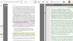
Instructors are encouraged to familiarize themselves with the software before the class session. Students may need to briefly familiarize themselves with downloading online newspaper articles as PDFs or Word format to store on Overviewdocs. No prior experience with data visualization, CSV files, or design necessary.
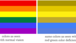
If the class includes students with hearing or seeing disabilities, instructors are encouraged to structure the assignment as a group project so as to partner disabled students with others in order to distribute the work according to ability. Resources for students with color blindness can be found here.
Assignment Description
This lesson plan provides an exercise in tracing patterns across large bodies of text across a period of time through an in-class activity on visualization with the simple open source tool RawGraphs.io. This activity requires that students acquire or assemble a collection of PDF or Word Document versions of online or digitized news articles either prior to the class session or, if using pre-existing sets linked above, in the first few minutes of the activity.
The Skills Workshop demonstrates how to export and visualize data in two steps. First, the students will learn how to filter through large data sets (document sets) on the text-mining software Overviewdocs by term, topic (“entity”), folder, or manually input metadata (“tag”). The workshop then demonstrates how to download necessary data in Comma Separated Value (CSV) excel spreadsheet files (CSV).
Second, the workshop guides students through uploading their CSV files unto RawGraphs. It shows how to visualize simple timelines (x-axis for time, y-axis for quantity (word count, popularity). It also covers slightly more complex visualizations, as presented in the Skills Workshop video.
The remainder of the class period should provide time for students to experiment with their visualizations. Expect students to try numerous graphs and possibly return to Overviewdocs many times to re-tag or re-organize information as necessary.
It is not necessary for students to be completely satisfied with their visualization at the end of the in-class activity. The purpose of the in-class activity is to show students how to create visualizations. Students may need more practice outside class to chose the most effective visualization format for their purpose.
Instructor Preparation
Instructors are encouraged to familiarize themselves with the software using the Skills Workshop video below prior to the lesson.Ensure that everyone has access to an Overview docs database prior to the in-class activity. Allow the students enough time to think about what information they may want to visualize in accordance with the grade weight of the assignment, unless factoring the activity only into the participation grade. Workshop topics if necessary. Allow the students enough time to think about what information they may want to visualize in accordance with the grade weight of the assignment, unless factoring the activity only into the participation grade. Workshop topics if necessary.
Student Preparation
Set up an account on Overviewdocs.Ensure access to a database prior to the in-class activity. Students may use one of the pre-existing sets linked above if needed. Preferably come prepared with an idea of a visualization project with the understanding that their topic may narrow or change.
In-Class or Assignment Instructions
First, we are going to download (export) data from a pre-existing data set (document set) on Overviewdocs. The Skills Workshop shows three different ways to filter information: searching by keyword or topic (entities), to search by organization tag, or to download by folder.
Second, the workshop walks through visualizing timelines and patterns on RawGraphs. It shows two different ways to download a set as a CSV files — how to download all tags in one file and how to download each tag in a different file. Then, it will show how these two file formats work in RawGraphs. The lesson video concludes by covering a few data visualization tips for customizing visualizations and data organization for specific projects.
The remainder of the class period should be reserved for allowing students time to experiment with the software. The instructor may reserve the entire period for sandboxing or reconvene the class in the last ten to fifteen minutes for a brief oral discussion depending on how quickly the students master the exercise.
Assessment Suggestions
This assignment is a workshop for building and introducing skills. Students should not be expected to produce a “final” product at the end of the class period. The in-class assignment is best assessed as a participation grade. In a visual rhetoric or visual writing class, the instructor has the option of mandating a graph in an essay, a final research project, or an in-class presentation.
This assignment can be developed into a student portfolio in two different ways. One option is incorporating the visualization into a “final project.” Another option is to require a short reflection essay on the in-class assignment.
This assignment can be incorporated into the overall participation grade. If the in-class activity is structured as a group assignment, the instructor can also assign a follow-up in-class presentation.