This sentence is in Lato.
Most likely.

Depending on your browser, what you’re reading might appear in Helvetica Neue. Or some more generic sans-serif.
Although the words remain the same in every iteration, the changes in their typographical representation matter. Whether something is written in a forthright font or a funky one, the choice of typography is your first impression of a text. It is a subtle but substantial decision. It makes an impact—and not just when you use Impact.
Meaning can change with typeface. Irony can be added when you write in Brush Script and a sense of seriousness added when you work in Bodoni. You don’t need to know the names to understand the point. Font families are as familiar as your mother tongue. With the advent of modern design and word processors, we all can speak the language of type without ever becoming conscious of it.
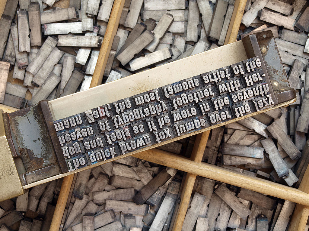
But, truth be told, that history is much older than the PC. Since the invention of the printing press, typography has become a rhetorical tool. Printers, publishers, and propagandists have used type to influence their audiences.
This semester, the DWRL Typography Research Group will take a hands-on approach to that long history. We will seek to understand and illustrate the rhetorical power of typography in a number of ways.
That will include, in part, developing a typography topography—a map that visualizes nationalistic uses of typography throughout history. In creating a cartographical representation, we hope to expose historical relationships between forms of nationalism and forms of font.
But we will also attempt to understand typography from the inside. By creating a typeface which captures the ethos of the DWRL, in much the same way as a type might capture the character of a nation, our group wants to realize the productive potential of designers to encourage identifications.
That’s a lot of work, and no doubt we’ll need to do a lot of research. But one thing you can trust we know already: Never to use Comic Sans.