As a writer, the most important concept is getting the message delivered—for it to mean to be conveyed, to be quick, and to be memorable. Maybe it’s that pesky background in advertising or the desire for students to learn or my own struggles with language—spelling is not my strong suit, nor grammar, nor anything else to do with reading and writing. Yet here I am—a writer, a researcher of language, a teacher of language—all because of hard work. AND a computer with spell check. AND professional editors. Use the tools you have available.
So what the font does this have to do with typeface?

Dyslexia.
Around ten percent of people suffer from it.
Smart, capable people. Creative people.
Dyslexia is a reading disorder; it is characterized by difficulties with reading, spelling, and decoding abilities despite normal intelligence. One area that is affected by dyslexia is reading performance and comprehension due to difficulties accessing written information.
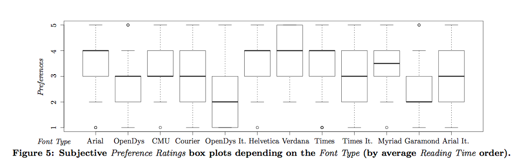
Is there a way to make reading more accessible to people with dyslexia? Luz Rello and Ricardo Baeza-Yates used eye-tracking software to see if there were fonts that would improve reading functions for those with dyslexia in their article “Good Fonts for Dyslexia” presented at the 15th International ACM SIGACCESS Conference on Computers and Accessibility. They had 48 participants with dyslexia read 12 comparable texts with varying font types. They used eye-tracking to see how quickly they could read the text and comprehension tests to see how much information they retained and understood. Turns out some fonts are better than others.
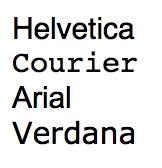
The winners: Helvetica, Courier, Arial, and Verdana.
These fonts were ranked the highest because they caused less eye-fixation in the eye-tracking test, higher reading comprehension, and were preferred by the participants.
Interestingly enough, the font OpenDyslexic, which is an open source font specifically designed for dyslexia, did not reduce the amount of time the participants spent looking at the words and was not a preferred by the participants when asked their preference ratings of the fonts.

And what are the implications?
As an “ad man,” a writer, a teacher—I think it’s pretty straightforward. I want to get my message across. I want my students to learn. I want to give everyone an equal chance. Turns out my choice of font matters when trying to turn those ideals into reality. Now that I know how important my font choice is in helping my students, or selling that new thingumabob, it’s time to dig deeper, use the tools available, and find more ways to font around with my message.
Featured Image Credit: Rello, Luz and Ricardo Baeza-Yates. “Good Fonts for Dyslexia.” 15th International ACM SIGACCESS Conference on Computers and Accessibility. Embassy Suites Hotel, Bellevue, WA. 22 Oct. 2013.