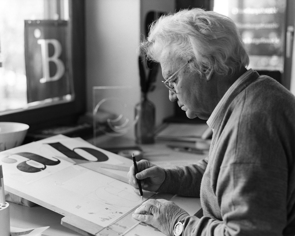
A few weeks ago, on September 10th, Adrian Frutiger passed away in his native Switzerland at the age of 87. If you don’t recognize his name, that’s just as well: Frutiger was among the foremost typographers in the latter half of the Twentieth Century, and a strong proponent of the belief that a typeface is best when its not noticed at all.
The designer behind such ubiquitous fonts as OCR-B and the eponymous Frutiger—which, respectively, you will find at the bottom of any check or on the overhead signage you check at airports the world over—among a few dozen others, we hardly notice Frutiger’s work even as we are surrounded by it. And that was the goal of good design, thought Frutiger:
“The whole point with type is for you not to be aware it is there. If you remember the shape of a spoon with which you just ate some soup, then the spoon had a poor shape.
Spoons and letters are tools. The first we need to ingest bodily nourishment from a bowl, the latter we need to ingest mental nourishment from a piece of paper.”
While it may seem poor form to begin a series of blog posts on the rhetoric of typography with an obituary, Frutiger’s work and philosophy typify what has long been the dominant way of thinking about type. In this traditional view, font choice is hardly a choice at all—type should be legible, regular, and well-balanced. “A letter follows the same canons of beauty as a face,” explained Frutiger: “A beautiful letter is in perfect proportion. The bar of a ‘t’ placed too high, the curve of an ‘a’ too low, are as jarring as a long nose or a short chin.”
Hence, the point is to get the point of the author across without distraction or intrusion from the shape of the letters. Although picking a font is necessary, the decision is never more than supplemental, and minimally so at that.
This stance, however, relies on certain presuppositions about textuality, about authorship, about reading. It relies (and reifies) a particular definition of the modern humanist subject, who knows the point he wants to make and tries his hardest to ensure the right reception. You can imagine who might fit that description and who might not. Derrida called this way of thinking logocentric, and so it might come as no surprise that typefaces aspiring to the ideals laid out by Frutiger have become exceptionally popular as corporate logos.
Look no further than the Internet’s most common landing page and Google’s much debated change in typeface:
We’ve changed a lot over the last 17 years, and today we’re changing things up again… http://t.co/gjK5Csd0pP pic.twitter.com/nNNMshhBat
— Google (@Google) September 1, 2015
In the second part of this post series, I will explore alternatives to this understanding of typography. In particular, I will look at the work of composition scholar Richard Lanham, which offers a way of foregrounding font choice as a rhetorical decision, rather than an invisible (albeit necessary) tool.
But until then, if you happen to be flying through JFK airport, make sure to keep an eye open for Frutiger’s work. Examples are more present than you might think.