Before getting to where the Typography Team’s™ cartography project has ended up, it might be a good idea to put these maps in context and point out how we got started down this particular(ly strange) path in the first place. It begins, as so many things do, with a slip.
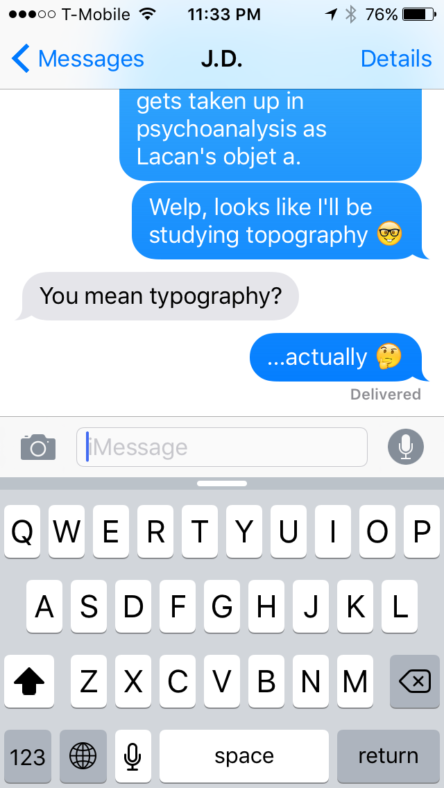 It was the week before the semester began, and I was on a beach working on a tan instead of working on a dissertation. Having just received word from the DWRL’s indefatigable leaders on my specific research group, I excitedly texted a friend and had the conversation on the right ———> ———> ———>
In the beginning, there was a typo. And so I went about creating a map of the earth according to different types of type, separating the serifs from the sans-serifs. And I saw that it was good—but you should really make that judgment for yourself.
Once I had it in my head to explore the rhetoric of letterforms according to latitude and longitude, the guiding question became a matter of deciding the sort of typographic differences and data to cartographically represent. Taking a cue from history, I began to consider the way that some typefaces have been used to evoke a sense of national ethos and design. The most timely example is the Swedish government’s recent announcement of that country’s official font, Sweden Sans, a modern, geometric sans-serif.

Or we might consider the dispute over the use of Fraktur versus Antiqua in Germany during the the 19th and early-20th Century, where the density and seriousness of the former was viewed as truly typifying a Germanic character. While it may seem somewhat absurd today, the stakes were grave enough that Otto von Bismarck once opined: I do not read German books in Latin letters! The above map, which illustrates the state of the debate circa 1901, became a touchstone for my own project, one which I would aim to replicate using pixels instead of colored pencils.
Utilizing the website CartoDB, the workings of which I emphasized in a previous post, I ultimately was able to map 4 sets of data:
- the fonts that were designed for the original Macintosh, all of which were named after “world class” cities
- nearly 100 prominent typographers since the invention of the printing press according to place of birth
- the style of typeface used in the nameplates of the top 25 US newspapers (plus Austin)
- a digital re-presentation of the above Fraktur-Antiqua dispute
Admittedly, the map is a busy one, but one of the features that I found most appealing about CartoDB was the maximalist ability to illustrate so much information at once—a desire counter to conventional definitions of good design, but one which we have emphasized repeatedly this semester as a potentially rhetorical approach. The map may be a little messy, a little rough around the edges, a little indulgent; but, in the end, so is rhetoric.
What is key here is that the map, like the material it represents, offers its readers choices and novel connections. Much like Borges’ art of cartography, what is visualized here is not meant to just be looked at, but to be explored in all its gaudy detail. In this, the Typography Team™ embraces the declaration of Deleuze and Guattari in A Thousand Plateaus that:
Writing has nothing to do with signifying. It has to do with surveying, mapping, even realms that are yet to come.