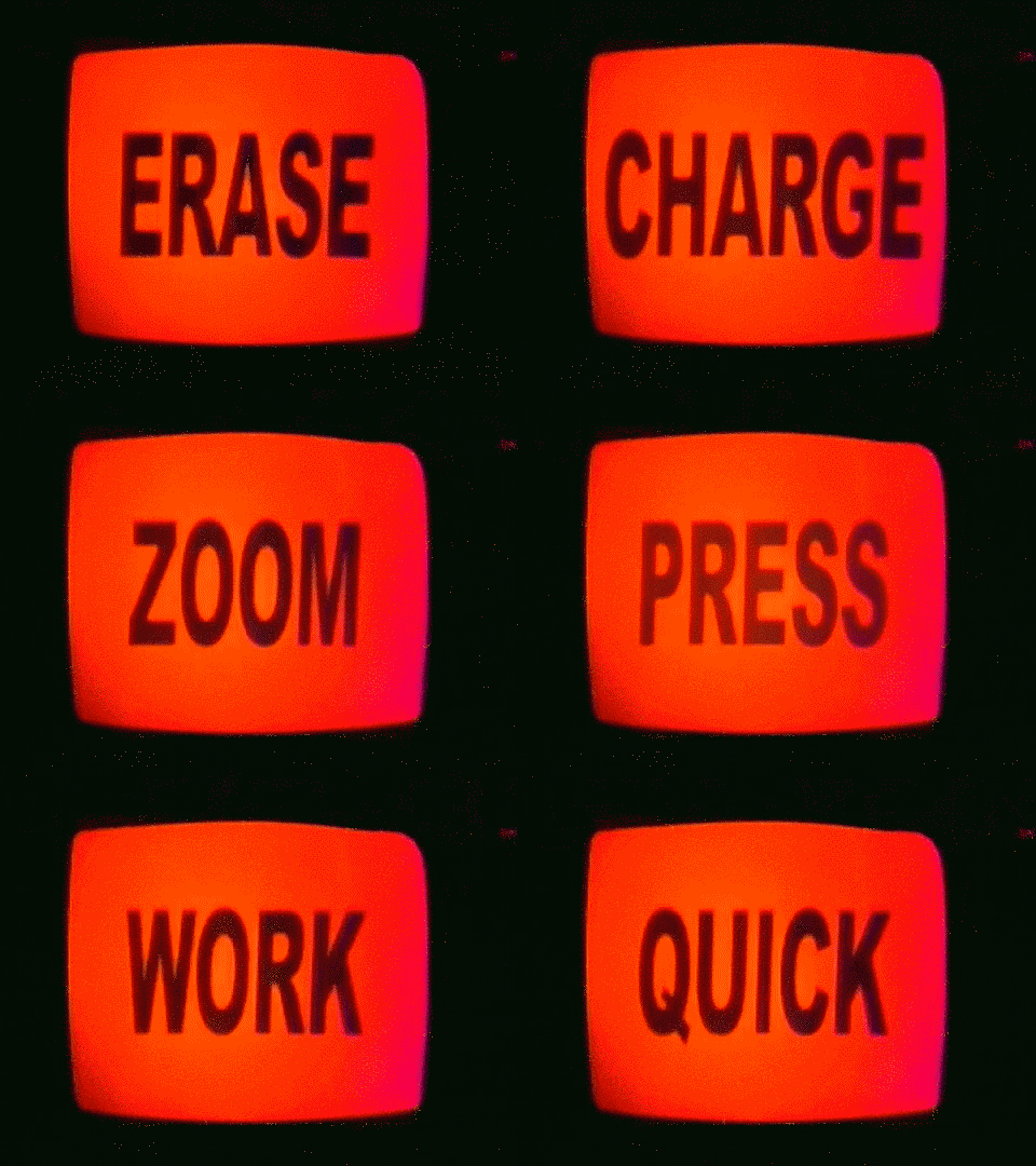
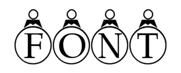
Previously in this space, I used the work of the late Adrian Frutiger to illustrate a particular way of thinking about typography. According to that view, a typeface is best when it goes unnoticed. Font is meant to invisibly transmit an writer’s point, without the letterforms interfering with either the author’s intent or the reader’s interpretation.
Responding to the advent of the personal computer during the late 1980s, in “The Electronic Word: Literary Study and the Digital Revolution” rhetorician Richard Lanham described this conventional way of (not) seeing type in prepositional terms:
Look THROUGH a text and you are in the familiar world of the Newtonian Interlude, where facts were facts, the world just ‘out there,’ folks sincere central selves, and the best writing style dropped from the writer as ‘simply and directly as a stone falls to the ground,’ just as Thoreau counseled.

In contrast to such conventional visuality, Lanham argues that the “razzle-dazzle” affordances of digital texts flip upside down “our traditional notions of literary and cultural decorum.” While we still can read through a text to locate an author’s meaning, electronic interfaces encourage us to look AT the words themselves, recognizing how their surface materiality “is now a malleable and self-conscious one.” For Lanham,
The interactive reader of the electronic word incarnates the responsive reader of whom we make so much. Electronic readers can do all the things that are claimed for them—or choose not to do them. They can genuflect before the text or spit on its altar, add to a text or subtract from it, rearrange it, revise it, suffuse it with commentary.

In a word, digital texts—especially as they are metonymically typified by typographic plasticity—promote anew a rhetorical relationship to the acts of reading and writing. Here Lanham’s claim is complicated and counter to conventional wisdom, but in his eyes, digital technology enjoins users to take note of how our notes are written, to no longer take the means of writing for granted. With as many options as most word processors provide, a document’s typeface becomes as fundamental and important a choice as the title.

Alright, maybe not as important as all that, but nonetheless necessary and informative. According to this take on type, font is not simply ornamental, but an indispensable part of writing. Hence the script you write in should call attention to itself in its relationship to the conveyed text, rather than trying for transparency.
Type is a type of rhetoric just as rhetoric is a matter of type. Writing—or, rather, in its digital form, typing with type in mind and in view allows authors and readers to literally see the contingent form of their praxis, that no text is simply self-evident without need of mediation. When typographic choices stand out, it complicates an ordinary understanding of closed meaning and suggests that ultimately everything is open to interpretation, to being seen differently.

