Designers have strong feelings about fonts and will spend hours picking out a font, making it the right size, moving it around to the right place. There are font that should never be used—Papyrus and Comic Sans always seem to make the list. Whereas other fonts are considered top notch—Times New Roman and Helvetica (which has its own documentary). As I mentioned in another post, there isn’t a lot of research on the topic of fonts and there is room for growth.
Originally I was going write about how much Papyrus is disliked as a font, but after looking into it and talking to Scott Ford, an art director and advertising design expert, I’ve decided that exploring what fonts are good and what fonts are bad, and why they are categorized that way, would be a great conversation for the classroom.
Who decides if a font is good or bad?
Other designers.
Should they have a say in it?
Personally, I think it’s too subjective and I want to see more research on this.
There are plenty of list out there for good and bad fonts. For example, 10 Iconic Fonts and Why You Should Never Use by Mathew Carpenter. This is an interesting list. It has the normal offenders—Comic Sans, Papyrus, Arial, and any “handwritten” font, but it also lists Helvetica, Franklin Gothic, and Trajan, which all normally fall on the list of good fonts.
Let’s talk about the true offenders.
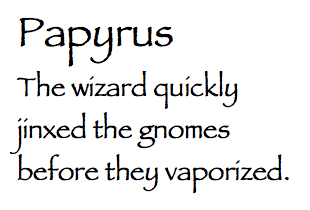 Papyrus: the amateur font. Designed in 1982 with the intent of looking like what English would look like if written on papyrus paper 2000 years ago. It has been called childish, kitschy, irritating, illegible, cheap, and generic. It’s not well liked. It was the font used in “Avatar” and has an I Heart Papyrus website, which has pictures of papyrus being used in many other places.
“The problem with Papyrus and its ugly cousin Comics Sans is that they were both designed for a very specific use and they were fonts designed for and in a very specific time, and that time has passed,” Ford told me. “Design evolved and Papyrus should have got left on the wayside but sadly it got bundled in as one of the first ‘graphic’ fonts ported to desktop publishing. To the average Joe having access to these new graphic fonts they implemented them everywhere, and very badly.”
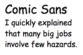 Comic Sans: for comic books. Released in 1995 and has been called the least professional font a designer could choose. Another font that is on most computers and has a cute look that is often used inappropriate.
“Comic Sans is great for children’s products, party invitations and (gasp) comic books. It is not suitable for product announcements, termination notices and funeral invitations,” Carpenter wrote.
Arial: a basic font. Not bad, not good. A so-so font that is definitely overused. It is very hard to tell Arial apart from Helvetica and was the default font in Microsoft office prior to 2007.
 Anything handwritten. Meant to convey more personality with font, but viewed as inauthentic by designers. On the research side, handwritten fonts actually make people remember more product information while they forget the price easier.
So what is a good or bad font?
According to Ford, “There is no such thing as a good or bad font, just good or bad implementation.”