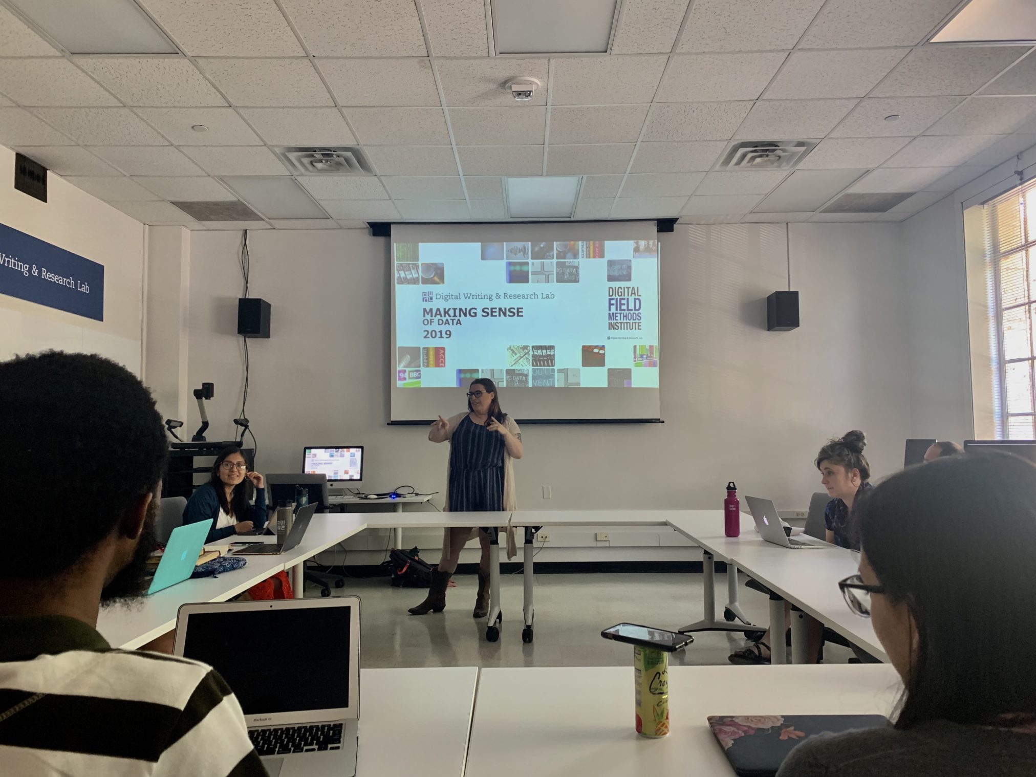
In the first workshop of the 2019-2020 school year, PhD candidate Amy Tuttle came to instruct the DWRL staff on making sense of data. While working with data can be terrifying to many humanities scholars, Amy sought to demystify the process of working with data for us all.
To this end, we began by discussing our own hesitations and fears of working with data, things like not liking numbers and not knowing technical language or methods. Amy reassured us that working with data requires skills many of us have been honing our entire academic career: creativity, close reading, and interpretation. Further, Amy gave us five traits of good data researchers: curiosity, clarity, creativity, skepticism, and humility. Certainly, these traits did not feel out of reach for us!
The next step was to familiarize ourselves with key concepts and vocabulary, including: data (assemblage of values), observations (instances of an observational unit), and attributes (properties of characteristics of observations). We looked at simple sample datasets Amy created, and brainstormed ways to create new fields of data from the existing data.
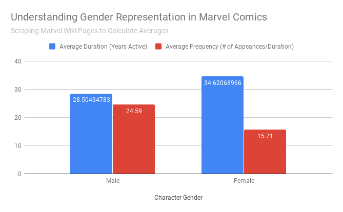
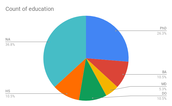
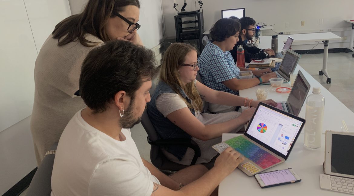
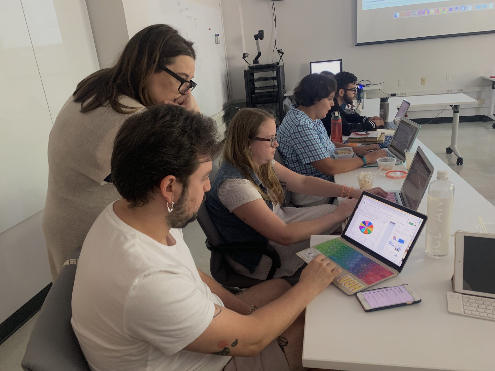
Then, the fun began. Using a sample set of data relating to Marvel’s Avengers, we were tasked with creating our own attributes and begin thinking about how to visualize this data using Google Sheets.
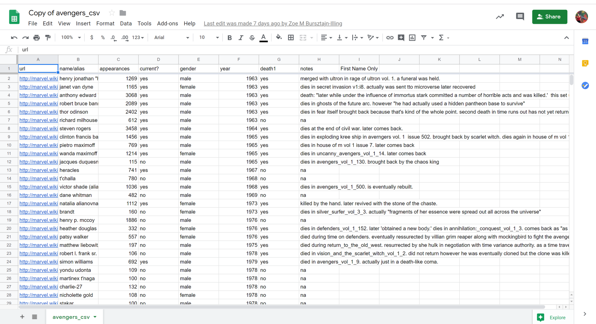
We were able to run wild with creativity, as people sought out to visualize the level of education among Avengers characters, the gender and number of appearances of characters, and where characters were from. Along the way, we ran into challenges trying to make our data dreams into reality. Sometimes Google Sheets would work in unpredictable ways, requiring us to rethink which attributes and values we were calling on and to work together to troubleshoot our visualizations.
Learning to make sense of and be comfortable with data is the first step for many of us, and next week we’ll be able to take those skills further with our workshop on data visualization.