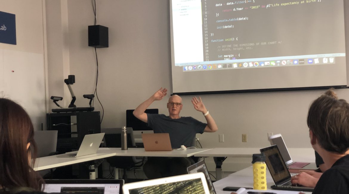
Using data to support an argument is standard, but putting together an interpretation of data that sustains your idea is not a simple task. That is why in the second workshop of the 2019-2020 school year, Pulitzer Prize winner Visual Journalist Chris Canipe came to the DWRL to teach us how to put together a scatterplot using D3.js.
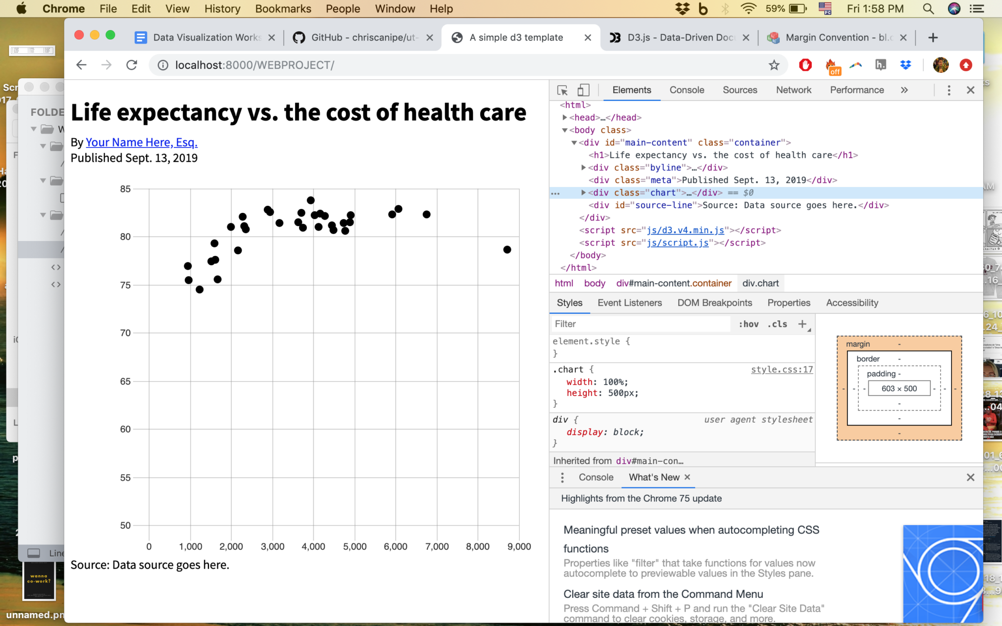
Chris Canipe’s goal with this workshop was to give us the tools to use data to tell visual stories. In order to do that, he walked us through the process of building Scalable Vector Graphics (SVG), and then how to use D3 to make selection of shapes, arrays and objects we wanted to use in our graph. We then built the axes of our scatterplot.
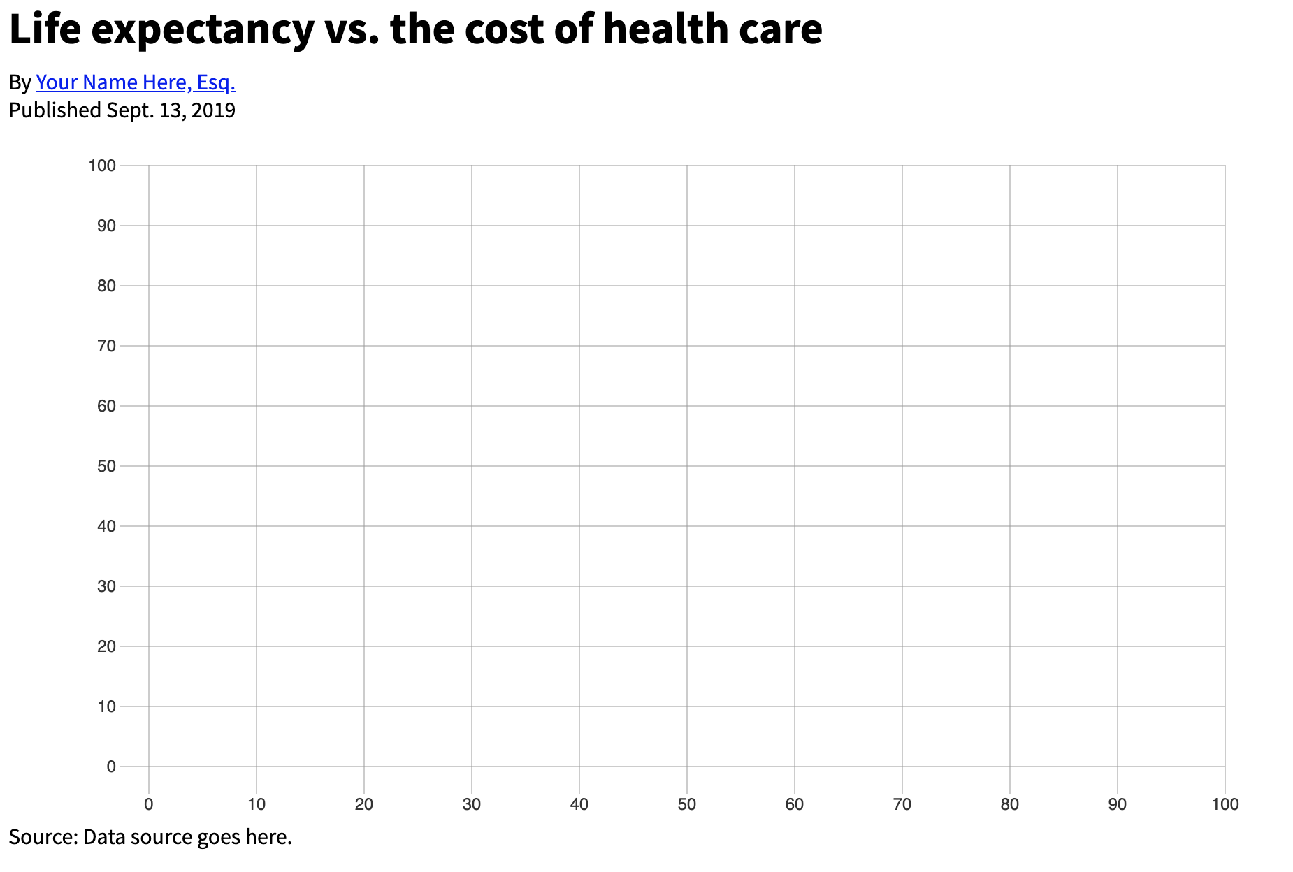
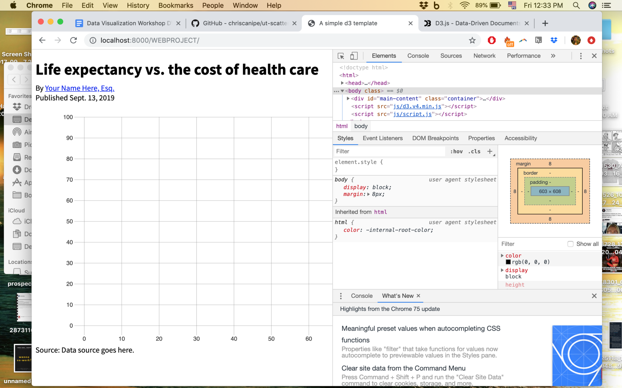
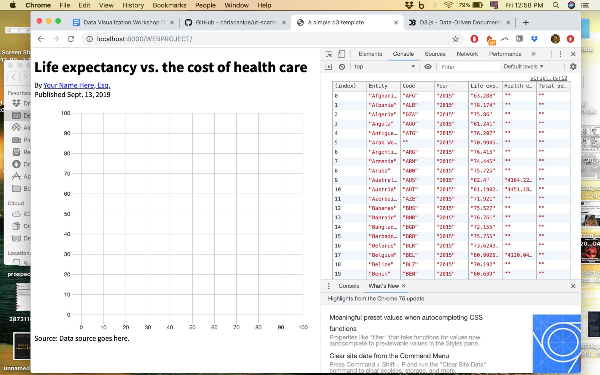
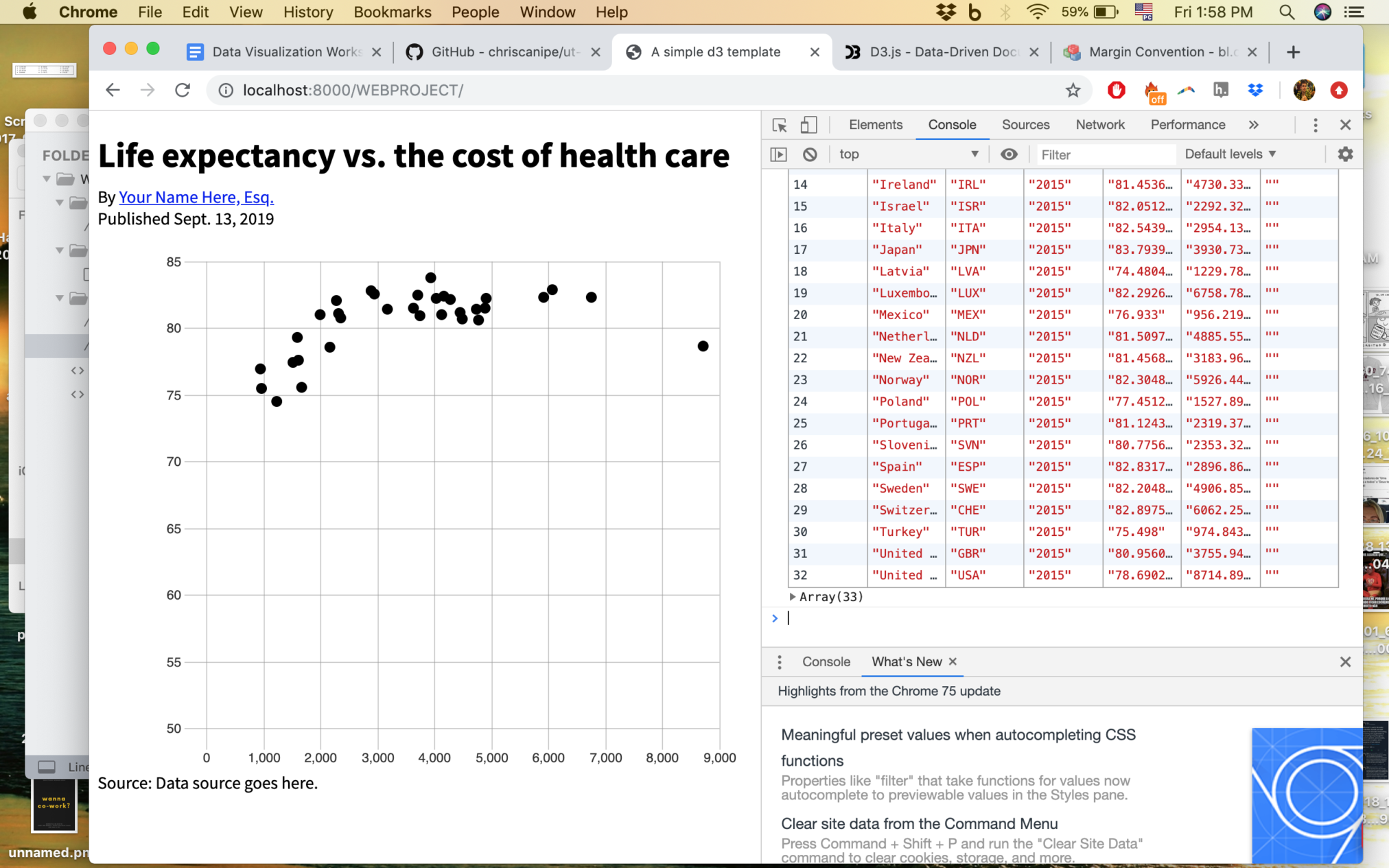
The next step was to learn about scales, converting data into pixel values, basically turning information into a coordinate in the graph. For this workshop, the data set we used was already cleaned up and ready for us to use for the graph, so we focused on adding it to the software and then transform it into the scatterplot. To finish up, we worked on changing the axes of the chart in order to make the data more easily understood and visually pleasing.
Working with code to build a visual expression of data was only a second step in this set of workshops. Next week we will work with data that needs cleaning and setting up and then on to the next step. Check out the following workshop recaps to learn more about what we will be doing in the DWRL this year. In here we are all very excited!
Some more resources we used:
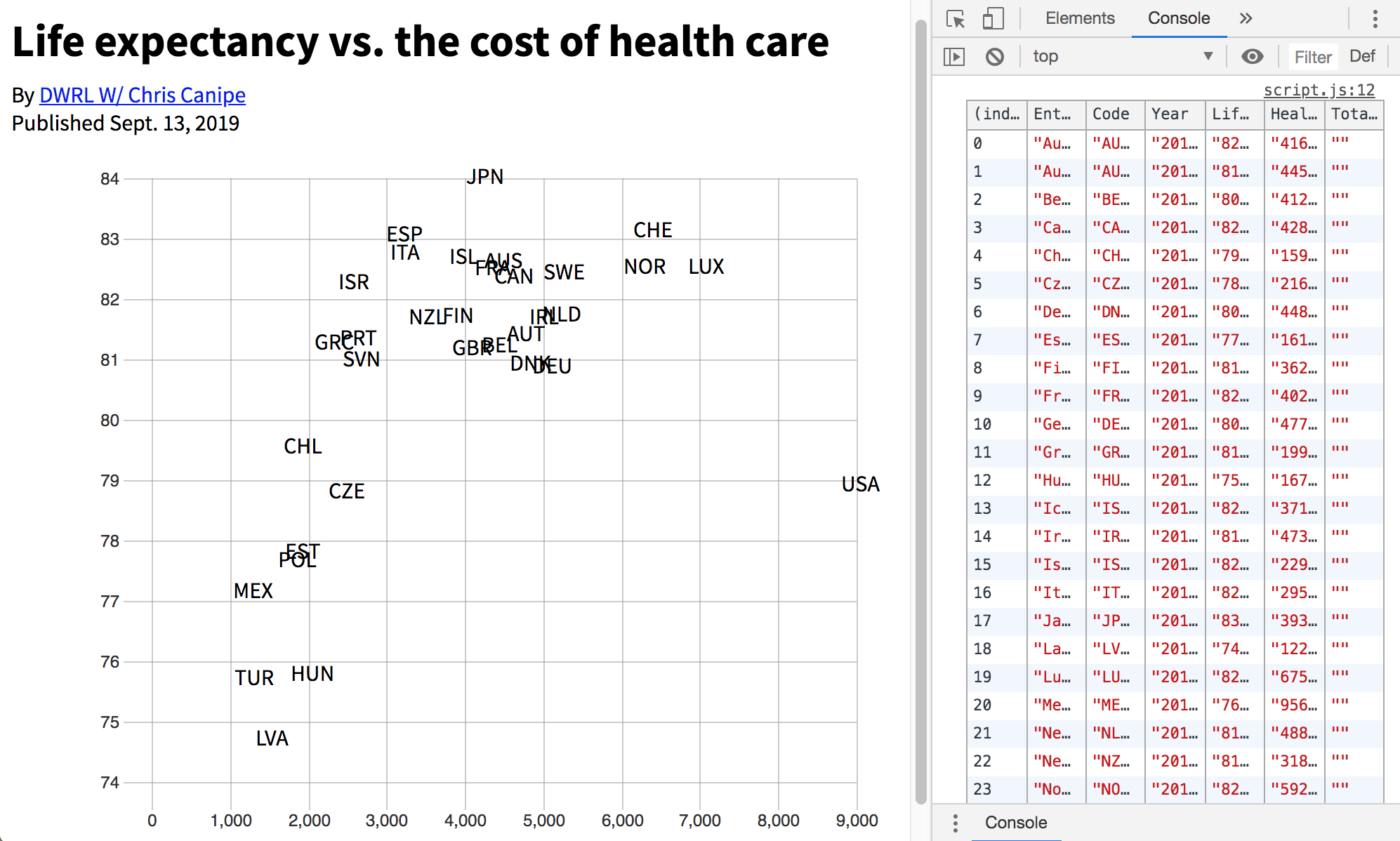
The dataset we used to put together our scatterplot was a Life Expectancy vs. Health Care Cost from Our World in Data, a project that uses “research and data to make progress against the world’s largest problems”.
To build out scatterplot, we used D3, an online data visualization library built to help people put together charts and graphs.
To get more code sets to explore different kinds of graphs we used Bl.ocks, a simple viewer for sharing code examples hosted on GitHub Gist.
To write code we used Sublime Text