![]() Everyday we encounter fonts and maybe some people think about them, but it doesn’t cross my mind unless the font is hard to read or when I actually design something it comes up. So why might someone design a font? To capture the spirit of their organization in a why that the current fonts do not. I chose to do it as part of my research project for the DWRL.
Everyday we encounter fonts and maybe some people think about them, but it doesn’t cross my mind unless the font is hard to read or when I actually design something it comes up. So why might someone design a font? To capture the spirit of their organization in a why that the current fonts do not. I chose to do it as part of my research project for the DWRL.
When I agreed to design a font I thought, “How hard can this be?” Put some Anchor points on an Illustrator page, pull and push some stuff, fill it in, and presto—fonts magically appear.
Well, that was a very wrong assessment of the situation.
I started out with free font software I could run a Mac. I tried an online version—turned out to be bit font, which wasn’t what I wanted. Then I tried a downloaded, open source program, which didn’t have intuitive controls and was not as easy to use as Adobe programs.
Well, back to square one—design it in Illustrator. Start with hand drawings.
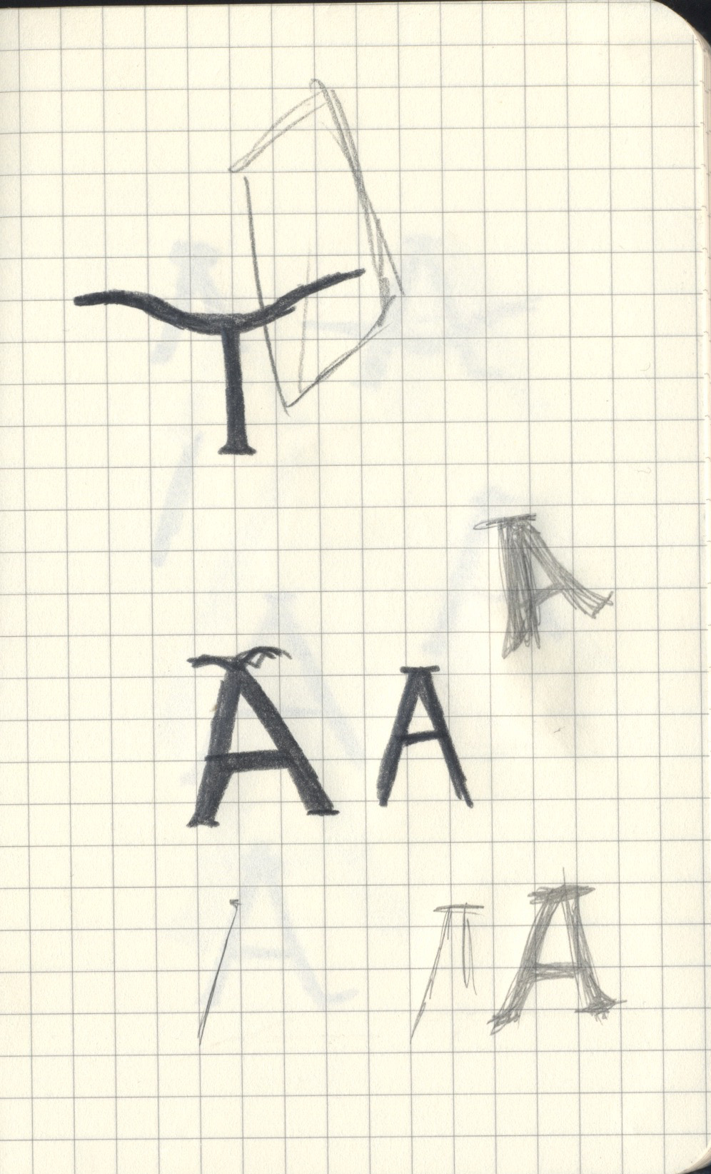
 Upload the image and trace it with the magic wand. Illustrator doesn’t have a magic wand. Let’s try this again in Photoshop. Remove the background. Next crop it in half and mirror image it. Well, that’s not really working either. Trace half the “T” and move the point to where I want them, then mirror image it. Now that’s what I wanted it to look like.
Most of that was done with the pen tool. Illustrator has a pen tool. I have to be able to do this in Illustrator. So I went back to the “art board.”
I also had the chance to work in Glyphs Mini. So after trying out the three different software, here are my thoughts on what works, or doesn’t, for font creation.
Photoshop
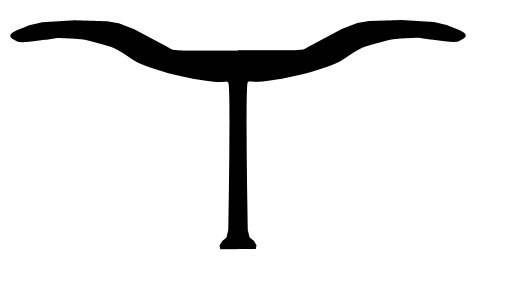
Not recommended. I started here because I was already familiar with this software. Hands down Illustrator and Glyphs Mini was better. I did the “T” above in Photoshop. Pixelated. This happens because Photoshop saves in pixels or bitmaps. Illustrator uses vector graphics that saves as a .tiff, which is a lossless compression algorithm based on mathematical formulas for storing raster graphics or in layman’s terms: it’s not saved as pixels and thus can be zoomed in, stretched, and made bigger without getting pixelated.
Illustrator
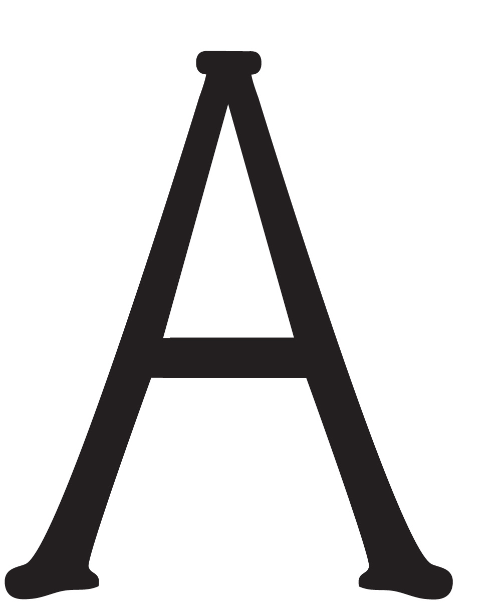
This is something Illustrator can do, with relative ease. Plus, the images being in vector makes it easy to scale up if needed. I started with hand drawings, used the pen tool to lay down anchor points, moved the points where I wanted, and filled it in. After getting the “hooves” created for the serif, I cut and pasted, rotated as needed, filled in. Tedious, but it worked.
Glyphs Mini
This software was designed to create a font. The tools are similar to Adobe products and it was easy to start using. I placed an image of the letter “A” I had made into Glyphs Mini, used the pen tool to lay down anchor points, just like I would in Illustrator … And then I noticed the lines on the “A” were not that straight in the Illustrator image. I’m still in the process of playing around with Glyphs Mini, but it is easy to use. It has fewer tools than Adobe, but I don’t think that will hinder my process. In fact, it might make it easier once I figure out how to use them because I’ll stop messing with all the tools I don’t actually need when creating a font in Illustrator.
Last thoughts
Trying to use this as an in class activity would not be feasible. Building a font should be a semester long dedicated class.