[cs_content][cs_section parallax=”false” style=”margin: 0px;padding: 45px 0px;”][cs_row inner_container=”true” marginless_columns=”false” style=”margin: 0px auto;padding: 0px;”][cs_column fade=”false” fade_animation=”in” fade_animation_offset=”45px” fade_duration=”750″ type=”1/1″ style=”padding: 0px;”][cs_text class=”cs-ta-center”]By Sierra Mendez & Sarah Welsh[/cs_text][/cs_column][/cs_row][/cs_section][cs_section parallax=”false” style=”margin: 0px;padding: 50px 0px 10px;”][cs_row inner_container=”true” marginless_columns=”false” style=”margin: 0px auto;padding: 0px;”][cs_column fade=”false” fade_animation=”in” fade_animation_offset=”45px” fade_duration=”750″ type=”1/1″ style=”padding: 0px;”][x_image type=”none” src=”https://www.dwrl.utexas.edu/wp-content/uploads/2016/11/infographics-charts-graphs_532d6299db623_w1500.png.jpeg” alt=”Image depicts an assortment of various charts of all types.” link=”false” href=”#” title=”” target=”” info=”none” info_place=”top” info_trigger=”hover” info_content=””][/cs_column][/cs_row][/cs_section][cs_section bg_color=”hsl(0, 0%, 100%)” parallax=”false” class=”cs-ta-left” style=”margin: 0px;padding: 45px 0px;”][cs_row inner_container=”true” marginless_columns=”false” style=”margin: 0px auto;padding: 0px;”][cs_column fade=”false” fade_animation=”in” fade_animation_offset=”45px” fade_duration=”750″ type=”2/3″ style=”padding: 0px;”][cs_text]Maybe we can begin by blaming Plato for his view that math, specifically geometry, was the one perfect truth in the world–a belief systematically strengthened by science’s insistent reliance on empirical, numerical data as “truth.” These notions have been adopted into the public conscious, leaving people with the tendency to treat quantitative evidence as unquestionable facts that are above argument.
Most students tend to say things like “numbers speak for themselves” when instead they should ask, “What story are these numbers being used to tell?” “Do the numbers actually say what is being said they say?” “What do these numbers really say?” As rhetoricians and instructors of literacy in the 21st century, we must help students examine how numbers are used across media sources for persuasion towards public, political, and personal ends.
Equally important is to teach students to use numbers correctly and ethically to make arguments and messages. This lesson plan will include several adaptable classroom activities for instructors who want to teach these concepts but feel apprehensive about their ability to explain “numbers.”
[/cs_text][x_custom_headline level=”h3″ looks_like=”h5″ accent=”false”]Learning Objectives[/x_custom_headline][cs_text]This lesson plan is designed to teach students to compose arguments with numbers and to teach students to critically analyze quantitative rhetoric put to use across the 21st century’s array of ambient multimedia narratives. [/cs_text][cs_icon_list][cs_icon_list_item title=”Think about numbers and stories based on numbers as constructions rather than as inherently "true"” type=”check” link_enabled=”false” link_url=”#” link_new_tab=”false”]Think about numbers and stories based on numbers as constructions rather than as inherently “true”[/cs_icon_list_item][cs_icon_list_item title=”Identify key design choices in the meaning-making process” type=”check” link_enabled=”false” link_url=”#” link_new_tab=”false”]Identify key design choices in the meaning-making process[/cs_icon_list_item][cs_icon_list_item title=”Tell a story through Excel charts” type=”check” link_enabled=”false” link_url=”#” link_new_tab=”false”]Tell a story through Excel charts[/cs_icon_list_item][/cs_icon_list][/cs_column][cs_column fade=”false” fade_animation=”in” fade_animation_offset=”45px” fade_duration=”750″ type=”1/3″ style=”padding: 0px 0px 0px 30px;”][x_feature_list][x_feature_box title=”Assignment Length” title_color=”” text_color=”” graphic=”icon” graphic_size=”40px” graphic_shape=”circle” graphic_color=”#ffffff” graphic_bg_color=”rgb(140, 140, 140)” align_h=”left” align_v=”top” side_graphic_spacing=”10px” max_width=”200px” child=”true” connector_width=”1 px” connector_style=”dashed” connector_color=”#272727″ graphic_icon=”clock-o”]1-2 class days[/x_feature_box][x_feature_box title=”Required Materials” title_color=”” text_color=”” graphic=”icon” graphic_size=”40px” graphic_shape=”circle” graphic_color=”#ffffff” graphic_bg_color=”hsl(0, 0%, 56%)” align_h=”left” align_v=”top” side_graphic_spacing=”10px” max_width=”200px” child=”true” connector_width=”1 px” connector_style=”dashed” connector_color=”#272727″ graphic_icon=”cut”]Microsoft Excel, an internet connection.[/x_feature_box][x_feature_box title=”Skills Necessary” title_color=”” text_color=”” graphic=”icon” graphic_size=”40px” graphic_shape=”circle” graphic_color=”#ffffff” graphic_bg_color=”rgb(140, 140, 140)” align_h=”left” align_v=”top” side_graphic_spacing=”10px” max_width=”200px” child=”true” connector_width=”1 px” connector_style=”dashed” connector_color=”#272727″ graphic_icon=”download”]Basic chart-making skills, taught in this lesson plan. [/x_feature_box][/x_feature_list][/cs_column][/cs_row][/cs_section][cs_section parallax=”false” style=”margin: 0px;padding: 45px 0px;”][cs_row inner_container=”true” marginless_columns=”false” style=”margin: 0px auto;padding: 0px;”][cs_column fade=”false” fade_animation=”in” fade_animation_offset=”45px” fade_duration=”750″ type=”1/1″ style=”padding: 0px;”][x_custom_headline level=”h2″ looks_like=”h3″ accent=”false”]Dr. Joanna Wolfe’s
“Rhetorical Numbers”[/x_custom_headline][cs_text]We highly recommend watching this lecture from Dr. Joanna Wolfe on Rhetorical Numbers in preparation for this class discussion. For more information, you can check out this blog post about her presentation. Also, remember, you can access full video transcripts from YouTube; excerpts from this could help your class.[/cs_text][x_video_player type=”16:9″ src=”https://www.youtube.com/watch?v=QtG9t8W7ANg” hide_controls=”false” autoplay=”false” no_container=”false” preload=”none” advanced_controls=”false” muted=”false” loop=”false” poster=””][/cs_column][/cs_row][/cs_section][cs_section parallax=”false” style=”margin: 0px;padding: 45px 0px;”][cs_row inner_container=”true” marginless_columns=”false” style=”margin: 0px auto;padding: 0px;”][cs_column fade=”false” fade_animation=”in” fade_animation_offset=”45px” fade_duration=”750″ type=”1/1″ style=”padding: 0px;”][x_custom_headline level=”h2″ looks_like=”h3″ accent=”false”]Data Narratives[/x_custom_headline][cs_text]Charts are one way numbers are used to tell a cohesive story. There are many types of charts and each allows you to say slightly different things. Pie charts are good for presenting parts of a whole, and line charts are good for tracking change across time. Most charts, even super fancy ones, are just variations of these. You might want to take a few minutes with your class to talk about the different stories charts can tell. [/cs_text][x_image type=”none” src=”https://www.dwrl.utexas.edu/wp-content/uploads/2016/11/cb467b83bb133b1c1a628ba31865f67b.jpg” alt=”A visualization depicting the nuts and bolts of chart types. Includes explanations that poke fun at histograms, bar charts, pie charts, line charts, area charts, bubble charts, radar charts, waterfall charts, tree maps, scatterplots, box plots.” link=”false” href=”#” title=”” target=”” info=”none” info_place=”top” info_trigger=”hover” info_content=””][/cs_column][/cs_row][/cs_section][cs_section bg_color=”hsla(169, 21%, 89%, 0.7)” parallax=”false” style=”margin: 0px 0px 0px 60px;padding: 10px 0px 45px;”][cs_row inner_container=”true” marginless_columns=”false” style=”margin: 0px auto;padding: 0px;”][cs_column fade=”false” fade_animation=”in” fade_animation_offset=”45px” fade_duration=”750″ type=”1/1″ style=”padding: 0px;”][x_feature_headline level=”h2″ looks_like=”h3″ icon=”paint-brush”]Data Narrative Design
[/x_feature_headline][x_gap size=”30px”][cs_text]In this section, we will focus on the anatomy of a chart—key design elements that shape how viewers “make sense” of quantitative presentations and how these factors can be manipulated to generate specific conclusions. Without these elements, numbers are just numbers. It is important to remember that, often, data visualization uses numbers to lead to meaning rather than stating meaning explicitly. Designers will provide a statistic or a chart that lends itself to a specific conclusion, but lets the viewer feel as if they’ve reached the conclusion by themselves based on data. This construct is essential to the scientific ethos.
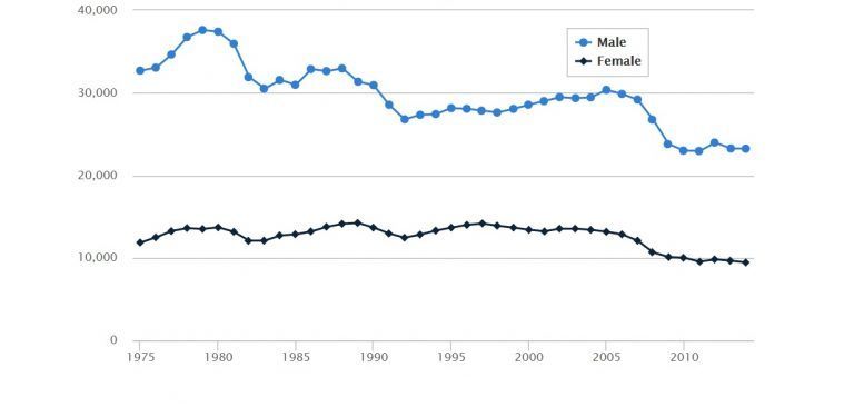
The title is the first thing viewers look at in a chart, sometimes the only thing. You have to be careful with them. Consider the chart below which was accompanied by the headline “Men or Women: Who are Really the Better Drivers?” Does the chart really answer this? Yes, according to the numbers, the number of fatal accidents involving male drivers was more than double the number of accidents involving female drivers, but there are a number of context questions left unaddressed. For example, statistically, do men drive more than women? Especially when you consider work commutes and truck drivers. This bigger picture is not addressed. Now, you could still say something about this chart. You could say, “You are more likely to be involved in an accident with a male driver than a female driver,” but you cannot make the claim this article is trying to make.
Labels are the categories along the axis that identify what variable is being displayed. You should use labels to give your reader a summary description of the variable you’re displaying. The labels also remind your reader what information you’re sharing with them and help limit confusion about the units.
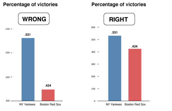
The scale is what you mark on the axes. It’s the relation between the units you’re using, and their representation on the graph i.e., the distance between marks. Scale greatly impacts the way a chart looks and, therefore, can have a great impact on the impression a viewer gathers. Consider the difference in impressions in the charts below.
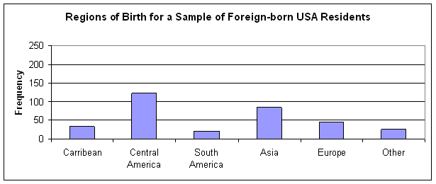
Units refers to words like “out of 100”, “gallons”, or “in millions” that make sure your reader knows what kind of information you are sharing. The graph below, for example, does not specify units. What confusion does this create?
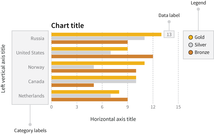
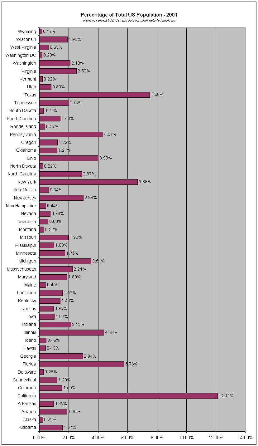
Organization is key to message making. You want to make your story easily identifiable. The chart below, for example, has not been organized clearly and, therefore, it’s extremely difficult to read its story. It’s in reverse-alphabetical order. It would have made a lot more sense to arrange from smallest-to-largest or largest-to-smallest to tell a cohesive story.
The above items are standard characteristics of most graphs and charts. For more information about design, formatting, and style particulars, please see this amazing online resource: Chapter 17 of Data + Design, “Perception Deception” by Mizel Djukic.[/cs_text][/cs_column][/cs_row][/cs_section][cs_section bg_color=”rgb(250, 250, 250)” parallax=”false” style=”margin: 0px 0px 0px 60px;padding: 10px 0px 45px;”][cs_row inner_container=”true” marginless_columns=”false” style=”margin: 0px auto;padding: 0px;”][cs_column fade=”false” fade_animation=”in” fade_animation_offset=”45px” fade_duration=”750″ type=”1/1″ style=”padding: 0px;”][x_feature_headline level=”h2″ looks_like=”h3″ icon=”globe”]Access and Adaptability[/x_feature_headline][x_gap size=”30px”][cs_text]If you don’t have a digital classroom, you can use a more theoretical or print-based approach to this lesson. You could print out some data for your students, and have them talk through some different stories that the data might tell.
Charts are an easy way to talk to students about accessibility. For instance, visualizations that rely too much on color can pose a problem for users who are vision impaired or colorblind. This chart that we made as an example for the skills workshop in this lesson, for instance, is almost accessible but not quite:
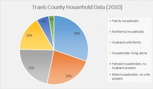
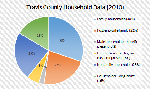
Though the pie chart itself is labeled, interpretation still relies mostly on being able to match colors, something we often take for granted. Here is the same chart, but with simply added designed to improve accessibility (and clarity):
Excel’s templates are easy to manipulate once you know how, which we talk about in the Skills Workshop.
[/cs_text][/cs_column][/cs_row][/cs_section][cs_section bg_color=”rgb(225, 229, 234)” parallax=”false” style=”margin: 0px 0px 0px 60px;padding: 10px 0px 45px;”][cs_row inner_container=”true” marginless_columns=”false” style=”margin: 0px auto;padding: 0px;”][cs_column fade=”false” fade_animation=”in” fade_animation_offset=”45px” fade_duration=”750″ type=”1/1″ style=”padding: 0px;”][x_feature_headline level=”h2″ looks_like=”h3″ icon=”cogs”]Assignment Description[/x_feature_headline][cs_text]In this assignment, students will be working with raw data sets to learn more about how numbers are manipulated for public consumption and to make specific rhetorical moves.
You will probably want to pick a couple data sets for your students to choose from beforehand. There are lots of data sets available on Austin Open Data, the US Census Bureau, and New York Open Data. Here are some Austin crime statistics as an example.
[/cs_text][x_gap size=”30px”][/cs_column][/cs_row][cs_row inner_container=”true” marginless_columns=”false” style=”margin: 0px auto;padding: 0px;”][cs_column fade=”false” fade_animation=”in” fade_animation_offset=”45px” fade_duration=”750″ type=”1/2″ style=”padding: 0px;”][x_custom_headline level=”h2″ looks_like=”h5″ accent=”false”]Instructor Preparation[/x_custom_headline][cs_icon_list][cs_icon_list_item title=”Watch Joanna Wolfe talk about narrative numbers.” type=”check” link_enabled=”false” link_url=”#” link_new_tab=”false”]Watch Joanna Wolfe talk about narrative numbers.[/cs_icon_list_item][cs_icon_list_item title=”Come prepared with a data set your students can use. It can be the one we've provided, or anything that might be more relevant to your subject area.” type=”check” link_enabled=”false” link_url=”#” link_new_tab=”false”]Come prepared with a data set your students can use. It can be the one we’ve provided, or anything that might be more relevant to your subject area.[/cs_icon_list_item][cs_icon_list_item title=”Review our Skills Workshop if you're unfamiliar with Excel, and be ready to answer questions for your students.” type=”check” link_enabled=”false” link_url=”#” link_new_tab=”false”]Review our Skills Workshop if you’re unfamiliar with Excel, and be ready to answer questions for your students.[/cs_icon_list_item][/cs_icon_list][/cs_column][cs_column fade=”false” fade_animation=”in” fade_animation_offset=”45px” fade_duration=”750″ type=”1/2″ style=”padding: 0px;”][x_custom_headline level=”h2″ looks_like=”h5″ accent=”false”]Student Preparation[/x_custom_headline][cs_icon_list][cs_icon_list_item title=”Come to class with an open mind.” type=”check” link_enabled=”false” link_url=”#” link_new_tab=”false”]Come to class with an open mind.[/cs_icon_list_item][/cs_icon_list][/cs_column][/cs_row][cs_row inner_container=”true” marginless_columns=”false” style=”margin: 0px auto;padding: 0px;”][cs_column fade=”false” fade_animation=”in” fade_animation_offset=”45px” fade_duration=”750″ type=”1/1″ style=”padding: 0px;”][x_custom_headline level=”h2″ looks_like=”h5″ accent=”false”]In-Class or Assignment Instructions[/x_custom_headline][cs_icon_list][cs_icon_list_item title=”Watch the video of Johanna Wolfe included in this lesson plan. This should get them thinking about narrative numbers and get the conversation started.” type=”chevron-right” link_enabled=”false” link_url=”#” link_new_tab=”false”]Watch the video of Johanna Wolfe included in this lesson plan. This should get them thinking about narrative numbers and get the conversation started.[/cs_icon_list_item][cs_icon_list_item title=”Talk to your students about "Data Narrative Design" with the information provided in the section above of the same name. What is the first thing viewers look at in a chart? What are some ways data can be manipulated?” type=”chevron-right” link_enabled=”false” link_url=”#” link_new_tab=”false”]Talk to your students about “Data Narrative Design” with the information provided in the section above of the same name. What is the first thing viewers look at in a chart? What are some ways data can be manipulated?[/cs_icon_list_item][cs_icon_list_item title=”Review the Skills Workshop with students briefly if they haven't done much work in Excel.” type=”chevron-right” link_enabled=”false” link_url=”#” link_new_tab=”false”]Review the Skills Workshop with students briefly if they haven’t done much work in Excel.[/cs_icon_list_item][cs_icon_list_item title=”Have students download a set of raw data from one of the sources we've provided or a source of your choosing.” type=”chevron-right” link_enabled=”false” link_url=”#” link_new_tab=”false”]Have students download a set of raw data from one of the sources we’ve provided or a source of your choosing.[/cs_icon_list_item][cs_icon_list_item title=”Put students into groups of two or three and have them take a look at the raw data they downloaded into Excel. What are the numbers saying just sitting there without being touched or sorted yet?” type=”chevron-right” link_enabled=”false” link_url=”#” link_new_tab=”false”]Put students into groups of two or three and have them take a look at the raw data they downloaded into Excel. What are the numbers saying just sitting there without being touched or sorted yet?[/cs_icon_list_item][cs_icon_list_item title=”Tell students to play around with the data in Excel and talk to each other about two different charts they could make with this data that tell two different stories. What might those stories look like? What might they speculate that different media outlets could do with this data?” type=”chevron-right” link_enabled=”false” link_url=”#” link_new_tab=”false”]Tell students to play around with the data in Excel and talk to each other about two different charts they could make with this data that tell two different stories. What might those stories look like? What might they speculate that different media outlets could do with this data?[/cs_icon_list_item][cs_icon_list_item title=”Allow your students about 30 minutes to make two different charts. Use the remainder of the session to talk about “what the numbers said.”” type=”chevron-right” link_enabled=”false” link_url=”#” link_new_tab=”false”]Allow your students about 30 minutes to make two different charts. Use the remainder of the session to talk about “what the numbers said.”[/cs_icon_list_item][/cs_icon_list][/cs_column][/cs_row][/cs_section][cs_section bg_color=”rgb(250, 250, 250)” parallax=”false” style=”margin: 0px 0px 0px 60px;padding: 10px 0px 45px;”][cs_row inner_container=”true” marginless_columns=”false” style=”margin: 0px auto;padding: 0px;”][cs_column fade=”false” fade_animation=”in” fade_animation_offset=”45px” fade_duration=”750″ type=”1/1″ style=”padding: 0px;”][x_feature_headline level=”h2″ looks_like=”h3″ icon=”pencil”]Skills Workshop[/x_feature_headline][x_gap size=”30px”][cs_text]There are lots of ways to make data visualizations online, but what if you just wanted to make a simple chart to enhance some research findings? Sometimes, all you really need is Excel- the original data visualization resource. Excel can pose quite a learning curve – especially when it comes to formulas – but their chart function is really pretty simple and versatile once you know how to use it. In a matter of minutes, you can produce a nice looking chart that you can use pretty much anywhere.
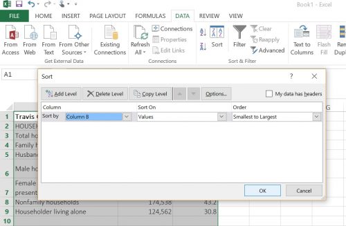
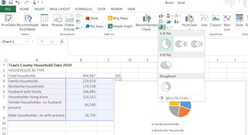
1. First you need some data. For the sake of this workshop, we pulled some household statistics for Travis County from the 2010 census. Look at your data and think about how it might be best represented. Would a pie chart work? What about a bar graph? Because of how quickly Excel can put charts together, you can try a few of each. You may first want to sort your data. We sorted this particular data set by number of households in descending order. In order to keep all the data together, highlight all the rows, navigate to the “data” tab, then sort by value.
2. Now all you’ll need to do is navigate to the “insert” tab and select the charts section where there are a number of options. We started with the pie charts.
3. There are many different ways you can edit the charts you make in Excel, most of which are already pre-programmed for you to choose from. A handy little edit function will pop up on the right-hand side of your chart.
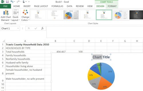
4. Polish up your chart, save it as a .jpg file and use it as you need to.
[/cs_text][x_video_embed no_container=”true” type=”16:9″][/x_video_embed][/cs_column][/cs_row][/cs_section][cs_section bg_color=”rgb(225, 229, 234)” parallax=”false” style=”margin: 0px 0px 0px 60px;padding: 10px 0px;”][cs_row inner_container=”true” marginless_columns=”false” style=”margin: 0px auto;padding: 0px;”][cs_column fade=”false” fade_animation=”in” fade_animation_offset=”45px” fade_duration=”750″ type=”1/1″ style=”padding: 0px;”][x_feature_headline level=”h2″ looks_like=”h3″ icon=”paperclip”]Assessment Suggestions[/x_feature_headline][x_gap size=”30px”][cs_text]This lesson plan is primarily about introductions, experimenting, and learning to work in a group. However, if you wanted to assign something like this as a final project, you could have each student work on their own, or put students in groups and have them invent arguments for their data sets. You might even have students write two different arguments for the two different charts they made, each about a page or so. [/cs_text][x_gap size=”20px”][x_tab_nav type=”two-up” float=”top”][x_tab_nav_item title=”Suggestions for Portfolio-Style Assessment” active=”true”][x_tab_nav_item title=”Suggestions for Traditional Assessment” active=”false”][/x_tab_nav][x_tabs][x_tab active=”true”]Have your students write a one-page reflection on the assignment and how it went. How did they go about making two different charts? Do they think that both arguments are effective? Why or why not? Ask your students to reflect on the process of making two different arguments from the same data set, and what they found to be more effective. [/x_tab][x_tab active=”false”]Have your students submit their charts along with short explanations of or arguments for their charts. Do both arguments make sense? How could they be better improved?[/x_tab][/x_tabs][/cs_column][/cs_row][/cs_section][/cs_content]