 Among the many other fantastic lesson plans outlined by our DWRL colleagues for the recent Digital Pedagogy Open House, the Typography Team™ offered the following exercise as one way to integrate a rhetoric of fonts into a writing classroom. In your typical freshman comp class, instructors often observe that a student tends to give more thought to what she writes than how she writes it, and so the goal of many assignments is to have students become more aware of how the how works to persuade, paying attention to the writing process and not just the written product.
Even so, a student is rarely asked to consider the actual material in which she presents her material, the spatial and visual properties in which she frames her thoughts, such as the typeface in which she has set her words. More often than not, students take the form of a text for granted, unconsciously relying on convention, preset qualities, and syllabus instructions—Times New Roman, 12-point font, with 1 inch margins—rather than making actual, intentional choices regarding font that can influence the point.
Borrowing from the Ancient Greek progymnasmata, the preliminary exercises for students of classical rhetoric, the present lesson plan suggests one technique for pointing out how, to use Marshall McLuhan’s maxim: The medium is the message.
The basic outline of this exercise is relatively simple, if a bit meta-conceptual, pretentious, or abstract; students will likely have all sorts of questions about the “rules” of the genre, needing strict guidelines to follow, but instructors are encourage to simply provide the following prompt, with a minimum of further instruction:
“What,” your students will ask, “is a prosopopoeia?” No, it does not mean a proposal paper in favor of a delicious Mexican dessert. Rather, prosopopoeia names a classical rhetorical figure wherein an author writes from the perspective of someone or, more specifically, something else. Pointing to the term’s etymology—prósopon means “face” and poiéin “to do”—Paul de Man argued that a prosopopoeia “confer[s] a mask or a face” by effectively putting words into another’s mouth, or even giving a mouth to another so that the other can speak.
To quote the Roman rhetorician Quintilian:
In this kind of figure, it is allowable even to bring down the gods from heaven, evoke the dead, and give voices to cities and states.
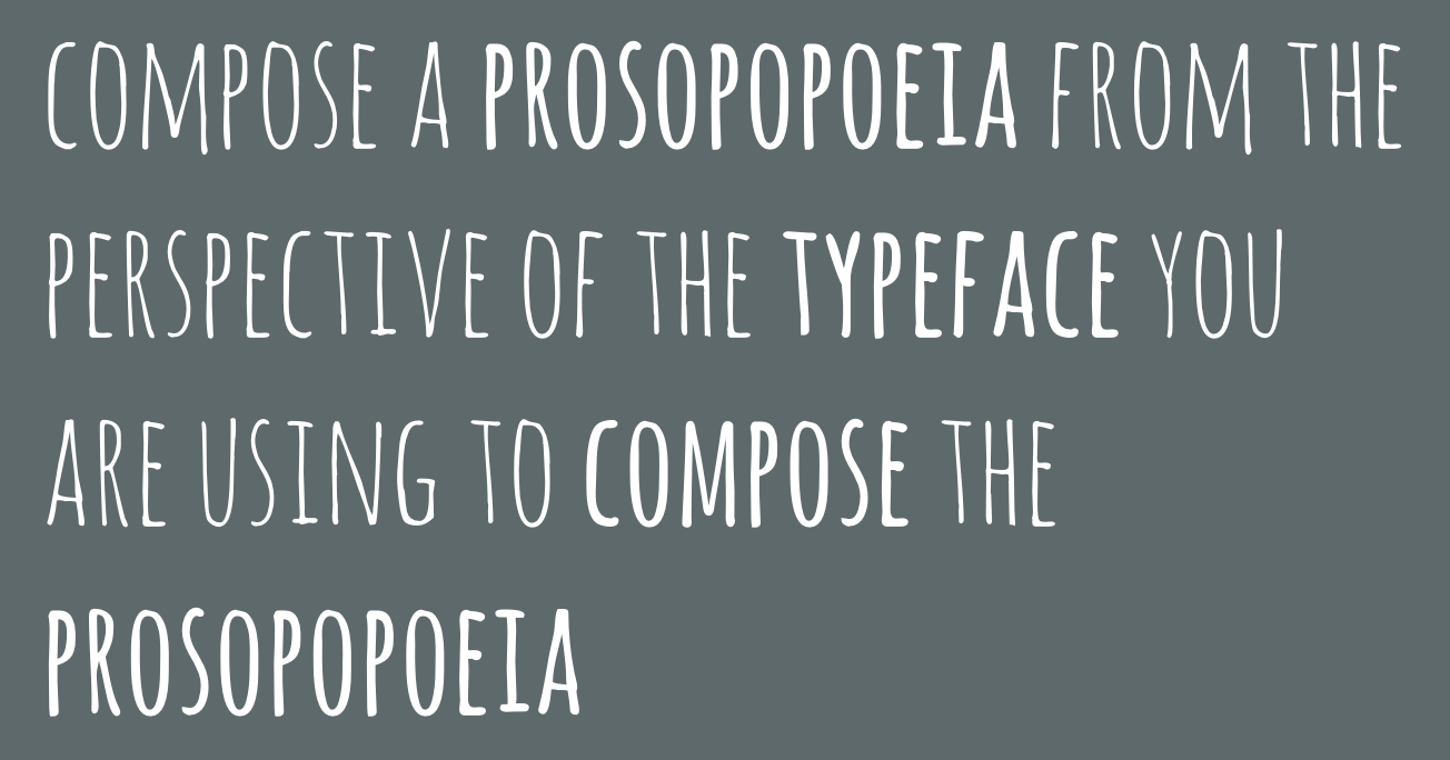
For our purposes, the subject is not so sublime; the goal is merely to give face to a typeface. The task is as simple as it is difficult: Students need only open up a word processor, arbitrarily pick a font from the long list of those provided, and write a paragraph from the point of view of the typeface itself—and just as with people, about what will depend on who (or, in this case, what) is speaking.
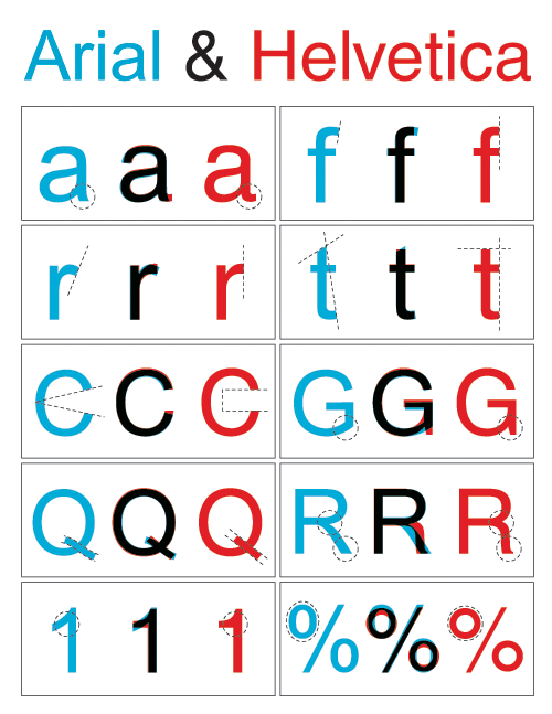 For example, Comic Sans would likely be interested in more innocent, more juvenile topics than, say, stately, plump Bodoni 72. Or perhaps Arial speaks with a chip on its shoulder and an inferiority complex about always being passed over in favor of its hipster older brother, Helvetica.
In addendum, a further variant of this exercise might involve the instructor providing an example prosopopoeia derived from the specific course topic—for a class on the digital divide, for instance, you could give your class a monologue from the perspective of a computer—which students set in the typefaces they think best captures or alters the text’s ethos.
In either assignment, the aim is not to demonstrate how typography might constrain the meaning of a text, though that point is implicit, but rather how font choice can add a surplus of signification: A touch of irony, a pinch of play, a soupçon of ambiguity. In raising awareness of type as a rhetorical matter, students will hopefully reconsider the relationship between form and content, no longer taking the formalities of academic writing for granted, but seeing how seeing the visual qualities of a word can offer up new possibilities of expression.