Today, I want to introduce a cool tool I have recently discovered: Google Fusion Tables. The basic idea is simple but powerful: the program will take any spreadsheet it is given, look for geolocation information in it, and display the individual items in the sheet on a map.
What you need: a Google account and some patience. The program is still pretty new and a couple of features are currently a little clunky. For instance, I’ve had trouble with automatically importing a local text file. The solution: make a Google spreadsheet of your data first and then have Fusion Table visualize on the basis of that.
By default, Fusion Table will look for the first column in your data that it can interpret as geo information, but you can also specify which columns should be taken as the basis for the map display. So if your map markers look off, you may want to play around with that a little. The program is smart enough to recognize city and county names, ZIP codes, and latitude-longitude pairs.
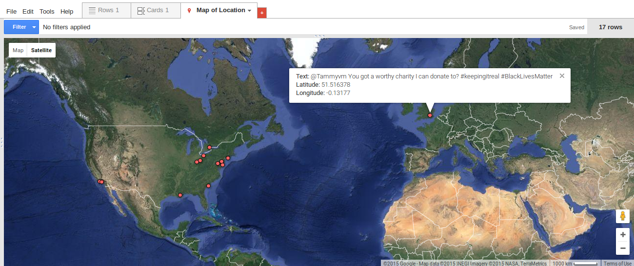
I use Fusion Tables to make interactive maps of the tweets I have been collecting in recent months. For instance, here is a basic map of the hashtag #BlackLivesMatter as it appears in July 2015 in my data. Feel free to explore the full map here.
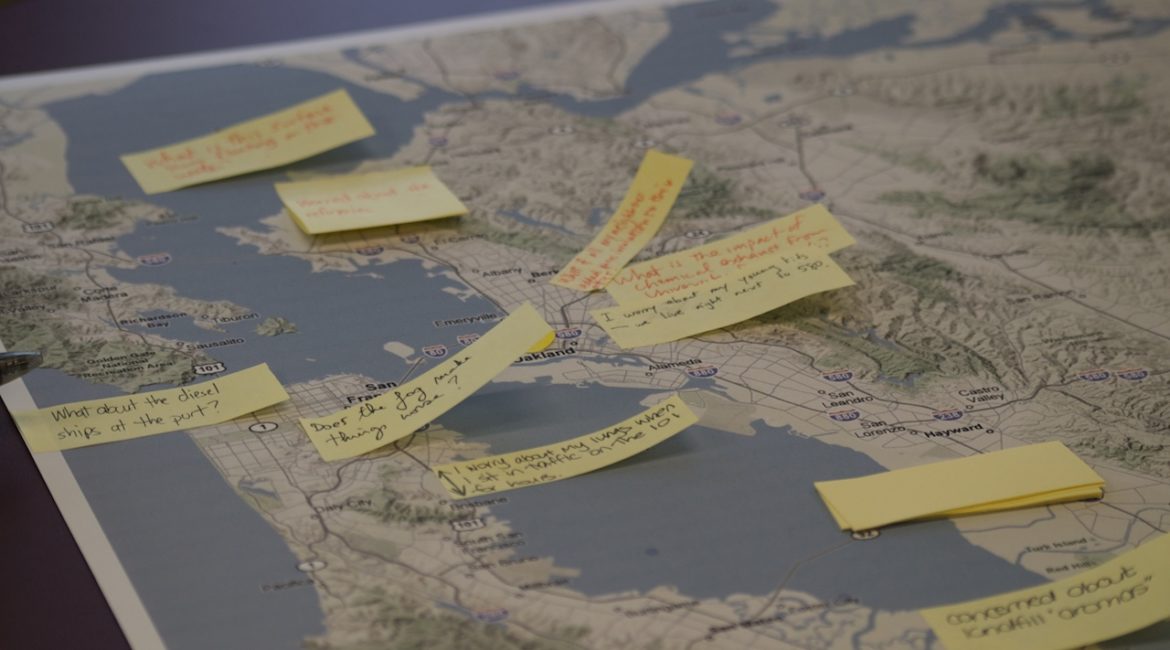
I imagine Fusion Tables could be a useful tool to utilize in the rhetoric classroom in a number of ways. One of the basic assignments in most rhetoric classes taught here at UT is “mapping a controversy.” To be sure, the trope of the map is an extended metaphor for the relations among different stakeholders’ positions.
But taking a more literal approach to topography also holds promises. Joseph Brentlinger points out in his podcast (published on the DWRL site with an accompanying lesson plan) that tapping into Twitter can help students understand and convey a sense of immediacy associated with their controversy.
Whether through Twitter or otherwise, situating different stakeholders, events, or discourses within the geography of the real world helps contextualize and relate to a conversation. Adding the dimension of time (unfortunately something that is not straightforward in Fusion Tables) can make powerful arguments about the development of a controversy and its current moment of stasis.
I hope to explore the potential of mapping tweets more fully by adding such a temporal dimension and visualizing different hashtags simultaneously. In the meantime, I would encourage instructors to experiment with Fusion Tables in the classroom.
A simple exercise to get student familiarized with the technology could be mapping the hometowns of all class members. After doing this, students should have enough experience to explore more challenging, rhetorical questions.