Source image: The Most Misleading Charts of 2015 Fixed on Quartz
To some students and readers, one of the rhetorical effects of data visualization is that the mere presence of a pie chart, graph, or timeline on a page confers “legitimacy” to an argument. At worse, this gesture attempts to obfuscate weak evidence. At best, the information conveyed may be correct but unnecessary to support an argument. In a piece for The New York Times, By the Numbers writer Charles M. Blow compared the act of using “charts to confuse rather than to clarify” to “using…[charts] like a drunken man uses lampposts – for support rather than for illumination”(x).
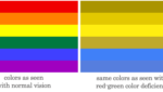
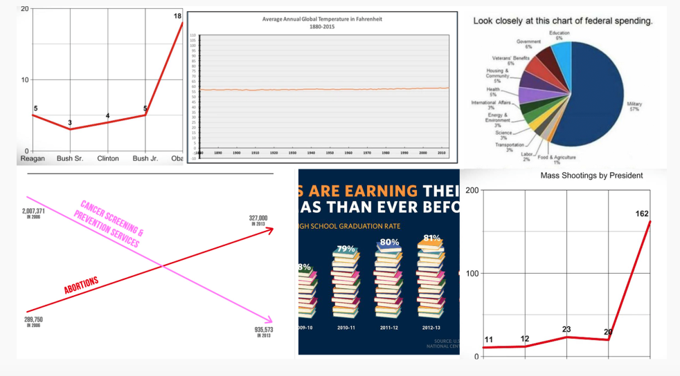
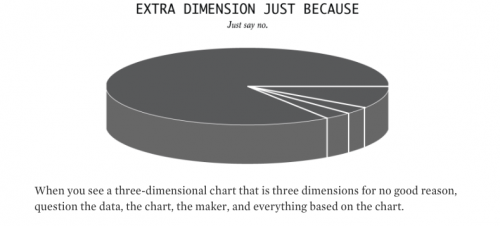
A “misleading” data visualization errs in style and substance. A chart can be misleading by design irrespective of the accuracy of its content. FlowingData’s Nathan Yau outlines a few ways to quickly scan for errors in “How to Spot Visualization Lies.” Most of Yau’s examples involve manipulation of scale or scope for the purpose of exaggeration. Others involve honest mistakes and bad design. Others offer technically correct information presented in a way that obscures the information itself to make a point, as in the case of unnecessarily three dimensional charts.
From “How to Spot Visualization Lies.
It is not that the unnecessary visualization proves the argument wrong. It is that presenting information in this way is the rhetorical equivalent of SCREAMING an ARGUMENT — loud, distracting, with more attention on emphasis than clear communication.
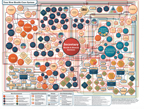
Of course, intentionally confusing one’s audience may be the point of an “ugly” infographic. Take, for example, this graphic outline of Obamacare released by the 2010 Joint Economic Committee. Not only is the information inaccessible, but the cluttered design intentionally obscures the information in a way that exaggerates the complexity of the system. The information on the chart is not included to advance an argument. The chart itself seeks to dissuade the viewer from investigating further.
In our own classrooms, we may notice students gesture towards unnecessarily “scientific” jargon in order to impress a point. The use of vaguely “scientific-y” language to prop up an argument signifies an epistemic insecurity. There is a false equivalence between “scientific” and “accurate,” as if the humanities do not contain the intellectual rigor to construct an “accurate” argument. If a line of inquiry is in the humanities, than the methods of argumentation should reflect that.
Last fall, the DWRL conducted an interview with Dr. Johanna Wolfe on her work on “rhetorical numbers.” She explained how to teach students to resist the idea that “numbers speak for themselves” by analyzing quantitative presentations as a rhetorical artifact.
The purpose of “close reading” a visualization is to uncover the ways in which a visualization inaccurately represented data. In some cases, the quantitative data is incorrect due to the visualization’s faulty scale or design. In other cases, the visualization may fail to convey the claimed information due to color scheme or design, or because visualization itself was an unnecessary rhetorical choice. In other cases, visualizations may be intended to (over)emphasize the complexity of a topic, enormity of a discrepancy, or otherwise work to elicit an emotion reaction independent of the information conveyed.
Visual consumers should also examine their own (highly subjective) affective responses to a visualization. Whether an image sparks anger, confusion, “clickbait” impulsive curiosity, or apathy, our immediate visceral reactions to an image is not (only) a reaction to data conveyed, but to whatever the designer has gathered data together to “sell,” be it a product or a political standpoint.
Such critical examination is particularly important when examining inadequate visualizations. The immediate response to identifying a “bad” image may be to keep scrolling, satisfied to have detected a falsehood or mistake. However, it not enough to detect a mistake without examining its intentional or unintentional effects. Effective visualization reading requires attention to accuracy and effect.
Fortunately, the internet provides students and teachers with many examples of “bad data viz” to analyze and improve upon. By browsing examples such as those on WTF Visualizations, in this piece for The Guardian, and in FlowingData’s Mistaken Data tag, students can acquire a sense of what to avoid in their own visualizations and what to look out for in the visualizations of others.