
It’s easy to consider digital rhetoric and writing in terms of always-advancing computer technologies. This isn’t inaccurate, and keeping our fingers on the pulse regarding the rhetorical affordances of new software makes for innovative digital writing, research, and pedagogy. At the same time, however, it’s helpful to remember that digital...
Lesson Plan: Visualizing The News As A Timeline
In today’s information economy, the abundance and production pace of information can make it difficult to follow news coverage of any given topic or event. Whether you are comparing different coverage of the same topic by more than one news source, tracking coverage of a topic in a single source...
Accessible Data Visualizations
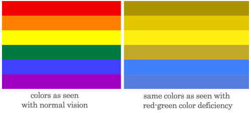
Are you reading this blog post from computer screen or an screen reader? Did you need to adjust the font or text size, screen brightness, or filter the interface through a browser extension or rely on an app like Accessibility to access this information? In her entry on "Access" in Keywords...
When Data Visualization Goes Wrong and Numbers Mislead
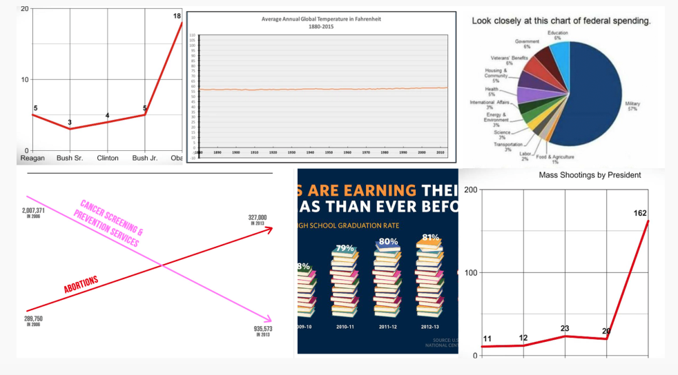
Source image: The Most Misleading Charts of 2015 Fixed on Quartz To some students and readers, one of the rhetorical effects of data visualization is that the mere presence of a pie chart, graph, or timeline on a page confers “legitimacy” to an argument. At worse, this gesture attempts to...
Lesson Plan: Visualizing Sound by Captioning Nonspeech Sounds
Although closed-captioning is usually thought of in terms of accessibility, it also highlights the larger rhetorical significance of sound—a significance which is most notably taken up in sound studies. The convergence of rhetoric with sound studies has become increasingly salient to rhetorical theory as noted in the review essay “Auscultating...
Lesson Plan: Viewing>writing>listening Pedagogical Versions of Access
Existentially, this lesson plan is about challenging student conceptions of information dissemination and questioning notions of universality embedded in web narratives of access. We like to think of the internet as a democratic space of unlimited maneuverability. But for many users, it is not. Here, we want students to consider...
Lesson Plan: Advanced Piktochart

[cs_content][cs_section parallax="false" separator_top_type="none" separator_top_height="50px" separator_top_angle_point="50" separator_bottom_type="none" separator_bottom_height="50px" separator_bottom_angle_point="50" _order="0" style="margin: 0px;padding: 50px 0px 10px;"][cs_row inner_container="true" marginless_columns="false" style="margin: 0px auto;padding: 0px;"][cs_column fade="false" fade_animation="in" fade_animation_offset="45px" fade_duration="750" type="1/1" style="padding: 0px;"][x_image type="none" src="http://www.dwrl.utexas.edu/wp-content/uploads/2017/11/giphy.gif" alt="" link="false" href="#" title="" target="" info="none" info_place="top" info_trigger="hover" info_content=""][/cs_column][/cs_row][/cs_section][cs_section bg_color="hsl(0, 0%, 100%)" parallax="false" separator_top_type="none" separator_top_height="50px" separator_top_angle_point="50" separator_bottom_type="none" separator_bottom_height="50px" separator_bottom_angle_point="50" class="cs-ta-left" style="margin:...
Lesson Plan: Infographics – Digital, Visual Stories
[cs_content][cs_section parallax="false" separator_top_type="none" separator_top_height="50px" separator_top_angle_point="50" separator_bottom_type="none" separator_bottom_height="50px" separator_bottom_angle_point="50" style="margin: 0px;padding: 45px 0px;"][cs_row inner_container="true" marginless_columns="false" style="margin: 0px auto;padding: 0px;"][cs_column fade="false" fade_animation="in" fade_animation_offset="45px" fade_duration="750" type="1/1" style="padding: 0px;"][cs_text] [/cs_text][/cs_column][/cs_row][/cs_section][cs_section bg_color="hsl(0, 0%, 100%)" parallax="false" separator_top_type="none" separator_top_height="50px" separator_top_angle_point="50" separator_bottom_type="none" separator_bottom_height="50px" separator_bottom_angle_point="50" class="cs-ta-left" style="margin: 0px;padding: 0px 0px 45px;"][cs_row inner_container="true" marginless_columns="false" style="margin: 0px auto;padding: 0px;"][cs_column fade="false" fade_animation="in"...
Lesson Plan: Transforming Data Visualizations
[cs_content][cs_section bg_color="hsl(0, 0%, 100%)" parallax="false" class="cs-ta-left" style="margin: 0px;padding: 45px 0px;"][cs_row inner_container="true" marginless_columns="false" style="margin: 0px auto;padding: 0px;"][cs_column fade="false" fade_animation="in" fade_animation_offset="45px" fade_duration="750" type="2/3" style="padding: 0px;"][cs_text]Contemporary rhetorical theory privileges a view of rhetoric as dynamic, where texts circulate both spatially and temporally to myriad effects. For instance, in her influential article "Unframing Models...
Lesson Plan: Visualizing and Analyzing Terministic Screens with Voyant
[cs_content][cs_section parallax="false" separator_top_type="none" separator_top_height="50px" separator_top_angle_point="50" separator_bottom_type="none" separator_bottom_height="50px" separator_bottom_angle_point="50" style="margin: 0px;padding: 50px 0px 10px;"][cs_row inner_container="true" marginless_columns="false" style="margin: 0px auto;padding: 0px;"][cs_column fade="false" fade_animation="in" fade_animation_offset="45px" fade_duration="750" type="1/1" style="padding: 0px 0px 0px 50px;"][x_image type="none" src="http://www.dwrl.utexas.edu/wp-content/uploads/2017/02/Terministic-Screens.png" alt="Word cloud created with Voyant's Cirrus feature displaying essential terms from Kenneth Burke's Terministic Screens." link="false" href="#" title="" target=""...