[cs_content][cs_section parallax="false" separator_top_type="none" separator_top_height="50px" separator_top_angle_point="50" separator_bottom_type="none" separator_bottom_height="50px" separator_bottom_angle_point="50" style="margin: 0px;padding: 45px 0px;"][cs_row inner_container="true" marginless_columns="false" style="margin: 0px auto;padding: 0px;"][cs_column fade="false" fade_animation="in" fade_animation_offset="45px" fade_duration="750" type="1/1" style="padding: 0px;"][cs_text class="cs-ta-center"]By Sierra Mendez & Sarah Welsh[/cs_text][/cs_column][/cs_row][/cs_section][cs_section parallax="false" separator_top_type="none" separator_top_height="50px" separator_top_angle_point="50" separator_bottom_type="none" separator_bottom_height="50px" separator_bottom_angle_point="50" style="margin: 0px;padding: 50px 0px 10px;"][cs_row inner_container="true" marginless_columns="false" style="margin: 0px auto;padding: 0px;"][cs_column fade="false"...
(Re)visualizing Data

Team Data Visualization is proud to present a new set of lesson plans that we've designed to be as cohesive as the first. With a little planning, anyone can share a data visualization lesson plan with their students. Sarah Welsh and Sierra Mendez collaborated on two lesson plans. The first takes inspiration from...
Visualizing Data with Google Maps

[cs_content][cs_section parallax="false" style="margin: 0px;padding: 45px 0px;"][cs_row inner_container="true" marginless_columns="false" style="margin: 0px auto;padding: 0px;"][cs_column fade="false" fade_animation="in" fade_animation_offset="45px" fade_duration="750" type="1/1" style="padding: 0px;"][cs_text class="cs-ta-center"]Visualization: Sierra Mendez. Text: Amy Tuttle.[/cs_text][cs_text]It's hard to believe that at one time, map ownership was a privilege reserved for the wealthiest members of a society. But thanks to modern surveying...
Cool Tools: Tableau
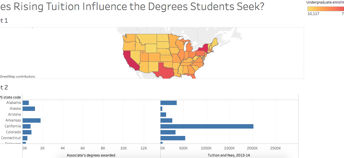
Last Friday, the DWRL hosted another workshop in preparation for the digitally accessible map we plan to create for our diverse student body. In conjunction with a discussion of collecting and analyzing data, Amy Tuttle provided an excellent lesson on Tableau, an online service that allows users to re-present data...
Affectively Interactive

One of my favorite data visualizations concerns the Beatles. Created by Adam McCann from Dueling Data, the graphic, amongst other things, lets the user hover their computer cursor over illustrations of band members to see how many hit songs those members have written and when. I find the visualization memorable,...
Adobe Creatives: What’s the Difference?
[cs_content][cs_section parallax="false" style="margin: 0px;padding: 45px 0px;"][cs_row inner_container="true" marginless_columns="false" style="margin: 0px auto;padding: 0px;"][cs_column fade="false" fade_animation="in" fade_animation_offset="45px" fade_duration="750" type="1/1" style="padding: 0px;"][x_image type="none" src="http://www.dwrl.utexas.edu/wp-content/uploads/2016/10/logos.001.jpeg" alt="" link="false" href="#" title="" target="" info="none" info_place="top" info_trigger="hover" info_content=""][/cs_column][/cs_row][/cs_section][cs_section bg_color="hsl(0, 0%, 100%)" parallax="false" class="cs-ta-left" style="margin: 0px;padding: 45px 0px 0px;"][cs_row inner_container="true" marginless_columns="false" style="margin: 0px auto;padding: 0px;"][cs_column fade="false" fade_animation="in" fade_animation_offset="45px" fade_duration="750"...
Teaching Data Visualization: An Introduction
[cs_content][cs_section parallax="false" style="margin: 0px;padding: 45px 0px;"][cs_row inner_container="true" marginless_columns="false" style="margin: 0px auto;padding: 0px;"][cs_column fade="false" fade_animation="in" fade_animation_offset="45px" fade_duration="750" type="1/1" style="padding: 0px;"][cs_text]Team Data Visualization is proud to present a set of lesson plans that are ready to use in your classroom (networked or not). Whether you’ve been thinking about introducing a data visualization...
Lesson Plan: Navigating Research with Mind Maps
[cs_content][cs_section parallax="false" style="margin: 0px;padding: 50px 0px 10px;"][cs_row inner_container="true" marginless_columns="false" style="margin: 0px auto;padding: 0px;"][cs_column fade="false" fade_animation="in" fade_animation_offset="45px" fade_duration="750" type="1/1" style="padding: 0px;"][x_image type="none" src="http://www.dwrl.utexas.edu/wp-content/uploads/2016/10/Mindmup4m.png" alt="A MindMup screenshot in which clusters of ideas are color-coded to demonstrate similar themes" link="false" href="#" title="" target="" info="none" info_place="top" info_trigger="hover" info_content=""][/cs_column][/cs_row][/cs_section][cs_section bg_color="hsl(0, 0%, 100%)" parallax="false" class="cs-ta-left" style="margin:...
Lesson Plan: Visual Literacy and Infographic (Re)Composition
[cs_content][cs_section parallax="false" separator_top_type="none" separator_top_height="50px" separator_top_angle_point="50" separator_bottom_type="none" separator_bottom_height="50px" separator_bottom_angle_point="50" style="margin: 0px;padding: 50px 0px 10px;"][cs_row inner_container="true" marginless_columns="false" style="margin: 0px auto;padding: 0px;"][cs_column fade="false" fade_animation="in" fade_animation_offset="45px" fade_duration="750" type="1/1" style="padding: 0px;"][x_image type="none" src="http://www.dwrl.utexas.edu/wp-content/uploads/2016/10/apple-on-desk.jpg" alt="""" link="false" href="#" title="" target="" info="none" info_place="top" info_trigger="hover" info_content=""][/cs_column][/cs_row][/cs_section][cs_section bg_color="hsl(0, 0%, 100%)" parallax="false" separator_top_type="none" separator_top_height="50px" separator_top_angle_point="50" separator_bottom_type="none" separator_bottom_height="50px" separator_bottom_angle_point="50" class="cs-ta-left" style="margin: 0px;padding:...
Lesson Plan: Data Collection and Database Rhetorics
[cs_content][cs_section parallax="false" style="margin: 0px;padding: 50px 0px 10px;"][cs_row inner_container="true" marginless_columns="false" style="margin: 0px auto;padding: 0px;"][cs_column fade="false" fade_animation="in" fade_animation_offset="45px" fade_duration="750" type="1/1" style="padding: 0px;"][x_image type="none" src="http://www.dwrl.utexas.edu/wp-content/uploads/2016/10/12210424505_2da556e2df_z.jpg" alt="A mystery scatter plot demonstrating how data doesn't make sense without context; a large number of colored dots arranged in vertical lines, with no axes, key or labels"...