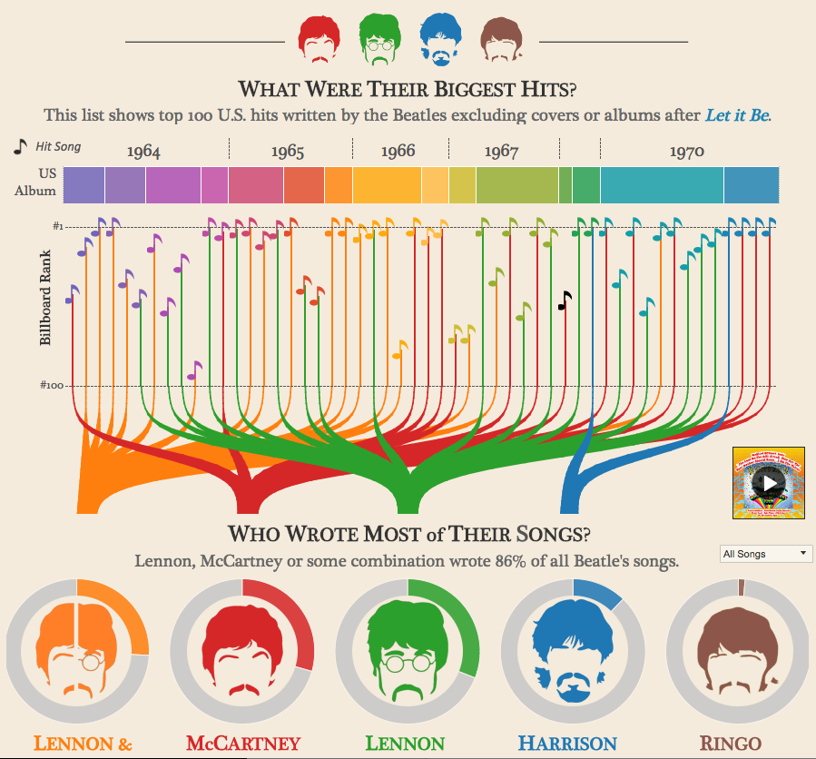
One of my favorite data visualizations concerns the Beatles. Created by Adam McCann from Dueling Data, the graphic, amongst other things, lets the user hover their computer cursor over illustrations of band members to see how many hit songs those members have written and when. I find the visualization memorable, no doubt, because I find the content interesting (e.g., the Lennon/McCartney duo falls off toward the end), but the graphic seems to resonate beyond that. This partly has to do with aesthetics, but there may be something else at work.
In “The Re-Emergence of Emotional Appeals in Interactive Data Visualization,” Charles Kostelnick argues that contemporary data visualizations make emotional appeals through design features (e.g., the use of colors to evoke affective responses) as well as a kind of interactivity made possible by online, digital media (117). Kostelnick draws on Enlightenment philosopher George Campbell’s belief that passions are heightened when people identify a close spatial and/or temporal proximity to an event (119), arguing that interactive designs foster a similar closeness between user and data by allowing users to customize displays. He writes, “Interactive data design changes the relationship between audience and visualization by enabling the audience to choose which data to visualize and often in what form” (126). The user can focus their attention on what they find interesting, an amplification of agency that serves to heighten the emotional connection audiences have with a text (127).
I could argue that the Beatles visualization has an affective impact on me because I can somewhat customize it to hone in on, say, John Lennon:
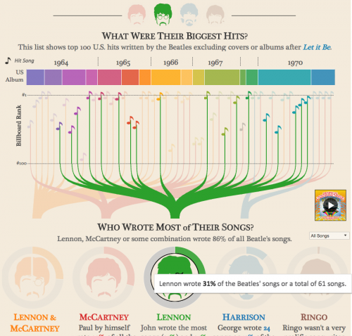
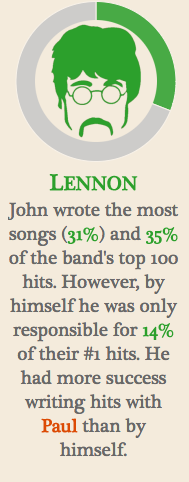
When I focus on Lennon’s data, I can’t help but notice the symmetry. I find the distribution of green pleasing. Emotionally appealing, even. So much so that it makes me somewhat resistant to McCann’s claim that Lennon had “more success writing hits with Paul than by himself” (Figure 1). I find myself questioning how “success” is defined. Does Lennon’s consistent output count for nothing?!
The point isn’t the validity of my reaction (or lack thereof), but that it occurred. Importantly, this discord speaks to a strength of the visualization, and such interplay between a graphic and alphanumeric discourse has implications for digital writing.
If we put Kostelnick into conversation with the idea that data visualization can be used for analysis (as David McCandless does in a TED Talk), we can consider the productive tension that emerges when an audience has such analytical means readily available to them. When I first considered data visualization as a method for discovering and representing information, I did so with the writer in mind. That is, I approached data visualization as something a writer uses to, more or less, invent and then control their argument. But it isn’t as simple as that (nor should it be).
By enabling a reader to interact with data displays within the text, a writer necessarily relinquishes a certain amount of control (or the illusion of such control, anyway) over their project. The author, in essence, gives the reader the analytical tools to challenge their project. Put another way, the reader can draw conclusions from the data that complicate the writer’s argument.
Certainly this can be said of all discourse, and rhetoric studies commonly frames writer, audience, and text as engaged in some sort of dynamic rather than their being static entities, so this isn’t new. From a pedagogical standpoint, however, digital writing that incorporates interactive data visualizations can serve to highlight and amplify this dynamic, as it not only reveals how data and texts are rhetorical, but it also invites audience engagement, including critique. It encourages a certain openness to vulnerability, maybe. As such, we can ask how such texts might evidence and further a writer’s commitment to rhetoric and writing as an ongoing conversation–a commitment that’s as affective as it is intellectual.