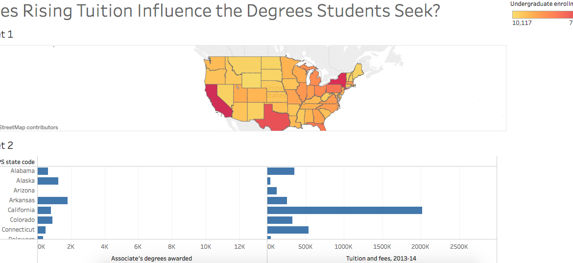
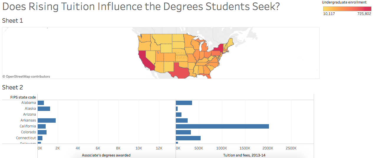
Last Friday, the DWRL hosted another workshop in preparation for the digitally accessible map we plan to create for our diverse student body. In conjunction with a discussion of collecting and analyzing data, Amy Tuttle provided an excellent lesson on Tableau, an online service that allows users to re-present data in creative ways, like this visualization of the relationship between the numbers of students enrolled and doctoral degrees earned by Reinhard Mueller, one of our staff members.
A very helpful tutorial by Tableau lays out the features of the service. First, download either your own data set or, to get your feet wet, use a data set provided by Tableau under the “Resources” tab. Then, upload that excel file to Tableau and the rest is as easy as click and drag.
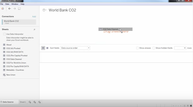
Once the contents of the data set appear, there are several options under “Dimensions” and “Measures” on the left-hand side that will allow Tableau to make sense of that data in a graph. By dragging and dropping “Country Code,” for example, a map appears with dots signifying the information in the excel sheet. You can create more than geographic maps. Tableau creates blocks, bubbles, bar graphs as well as the more familiar scatter and line graphs, among others others — and you have control over colors to draw a reader’s attention to particular trends. In my graph above, for example, the redder a state is, the greater the per capita number of undergraduate students; conversely, the yellower a state, the fewer the per capita number of undergraduate students.
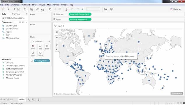
Tableau offers users a unique opportunity to create maps and graphs that would typically require a tremendous amount of manual work to produce. By clicking and dragging, Tableau allows users to convey complex data sets into accessible visual information.