Are you reading this blog post from computer screen or an screen reader? Did you need to adjust the font or text size, screen brightness, or filter the interface through a browser extension or rely on an app like Accessibility to access this information?
In her entry on “Access” in Keywords for Disability Studies, Bess Williamson notes that despite advances in accessibility rights due to technology, “technical change does not necessarily translate to the deeper goals of openness, inclusion, or opportunity” (15). Creating “access” to information using data visualization requires rethinking the material practices, and rhetorical contexts, of reading an image at every level of production.
Throughout the 2016-2017 academic year, the DWRL used data visualization in various projects on accessibility. At the same time, we have tried to consider what makes a visualization “accessible” in the various definitions of the word.
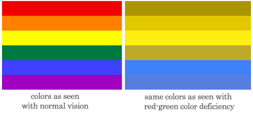
Strategies for designing visualizations for viewers with color-blindness include using gradients (including practicing with the underrated color gray in visualization), apps and software like Color Contrast Check or Dankam to test for accessibility, and exploring color palettes with resources such as the virdis color palettes page.
The tool Chroma.sj Color Scale Helper allows beginners to design their own color palettes, and a more advanced designer could use either ColorBrewer 2.0 or Colorpicker for data.
The extremely ambitious can progress to IWantHue. Coders who use Python can look into KDnugget’s open source notebook with the Python code used to create visualizations like those seen in this post.
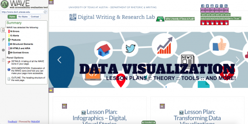
Accessible design for data visualization requires going beyond the design of the image itself. One must also ensure the accessibility of the online platform used to host the image. If you are hosting the image on your blog or website, you may need to make sure that your interface is accessible. The WAVE Web Accessibility Evaluation Tool is a website that checks the accessibility of a webpage by identifying the elements that may not translate to a screen reader.
To use WAVE, copy and past a url into the search bar. WAVE will then identify the elements of a webpage that that may not translate to a screen reader.
This allows users to adapt the platform accordingly so to prevent images on an interface from confusing a screen reader. The easiest way to do this is to add alt-text to an image.
The DWRL is committed to access. Feel free to contact any of our assistant directors if you are looking for help with accessible design in your classroom.