Have you thought about incorporating infographics into your classroom? Here at UT, the first year writing curriculum now includes an infographic assignment in which students are asked to remix their final persuasive essay into a visual form. The Digital Writing & Research Lab has been collaborating with the Department of Rhetoric & Writing to create an assignment prompt and tool recommendations, and given that it’s syllabus creation time around the country, we thought we’d share one of those resources with you.
One of the major concerns in designing this assignment was figuring out which tool would be best for students to compose their infographics. Every year, several first year writing classes are held in the DWRL’s computer classrooms, which have computers for every student, all equipped with professional-level image manipulation software. But most classes meet in traditional classrooms, with an instructor station that, if you’re lucky, has an old version of Word that will still fire up. So we needed to find a tool that was available to students on their own devices, or on library or other university-owned computers.
Enter Piktochart. Rhetoric scholars may be familiar with this tool from Nathaniel Rivers’ Thinker/Thought, a series of infographics outlining key ideas from influential texts and scholars in the field. But in short, Piktochart is a page layout web app that’s primarily targetted at infographic creation. Users can choose from a variety of templates or create their own, and use a drag-and-drop interface to add text, photographs, and other graphic elements. Color and font selections are made using a fairly familiar WYSIWYG editor, and you can add hyperlinks to most elements.
The free level gives you access to a number of different templates and sharing options, with more available to pro subscribers. One downside, though: it poses some accessibility challenges (you’ll see that we’ve provided alt text in a separate document for the infographic embedded below). Instructors will want to test this out ahead of time to ensure it’ll work for their students.
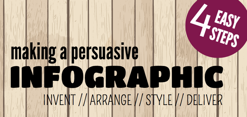
In all, we considered the learning curve with this tool to be pretty shallow, especially as Piktochart offers a robust series of video tutorials. But we wanted to provide students and instructors in UT’s writing program with a simple, targetted tutorial to support their work in this new medium. To that end, I used Piktochart to create the infographic tutorial below (meta!).
It’s designed to highlight the key features of the tool and I’ve embedded Piktochart’s own tutorial videos as appropriate. But it’s also structured around the canons of rhetoric to help students effectively compose infographics, thinking through questions of arrangement and design in both visual and informational senses.
This will be rolled out in UT classes in the fall, and we hope to be able to share some of our students’ work with you towards the end of the semester. In the meantime, this content is provided under a Creative Commons By-Sharealike license — so please feel free to adapt or use it in your own classes. There’s a student-facing version on Piktochart’s website — without all the instructor-facing metadiscourse associated with the version embedded here — which you can use in your own classroom. And if you do, please let us know how it goes!