[cs_content][cs_section parallax=”false” style=”margin: 0px;padding: 50px 0px 10px;”][cs_row inner_container=”true” marginless_columns=”false” style=”margin: 0px auto;padding: 0px;”][cs_column fade=”false” fade_animation=”in” fade_animation_offset=”45px” fade_duration=”750″ type=”1/1″ style=”padding: 0px;”][x_image type=”none” src=”https://www.dwrl.utexas.edu/wp-content/uploads/2016/10/12210424505_2da556e2df_z.jpg” alt=”A mystery scatter plot demonstrating how data doesn’t make sense without context; a large number of colored dots arranged in vertical lines, with no axes, key or labels” link=”false” href=”#” title=”” target=”” info=”none” info_place=”top” info_trigger=”hover” info_content=””][/cs_column][/cs_row][/cs_section][cs_section bg_color=”hsl(0, 0%, 100%)” parallax=”false” class=”cs-ta-left” style=”margin: 0px;padding: 45px 0px;”][cs_row inner_container=”true” marginless_columns=”false” style=”margin: 0px auto;padding: 0px;”][cs_column fade=”false” fade_animation=”in” fade_animation_offset=”45px” fade_duration=”750″ type=”2/3″ style=”padding: 0px;”][cs_text]Some public data makes sense , and some data does not. Not only does this have to do with the way data is presented or cherry picked, but research suggests that in order to get credible results, surveys should provide clear questions that are unambiguous, unbiased, and worded in a way that prompts respondents to answer truthfully (Dillman 2007). This might seem obvious when it’s written down as it is here, but the importance of a survey’s rhetoric may not be immediately obvious to your writing students. How a survey is written is key to getting good results: vague questions can produce information inaccurate or misleading information. Lev Manovich talks about “database rhetorics” as essential to understanding contemporary forms of cultural production (Losh 2015), so, let’s get started.[/cs_text][x_custom_headline level=”h3″ looks_like=”h5″ accent=”false”]Learning Objectives[/x_custom_headline][cs_text]Because introductory statistics classes don’t always go into question frameworks for data collection in detail, what better place to reinforce this than in a writing classroom? The purpose of this two-part lesson plan is to help develop students’ abilities to critically analyze survey questions, to understand how to collect data, and to narrativize the results. This lesson plan requires a homework assignment, and should be planned over two class periods about a week apart from each other.
Some arguments are stronger when they are backed up by data, and people trust data to make all kinds of decisions that affect their lives. However, data is often inaccurate or poorly misrepresented as a result of a flaw in the design, methodology, or rhetoric of the survey used to collect the data. Instead of just talking to students about this, why not show them how to design a good survey?
An introduction to data collection in the humanities can be done with special attention to the way the questions are designed. In this lesson, you’ll work together with your students to create a survey about undergraduate music preferences (or whatever you like) and analyze the results. By working with your students to write the survey and analyze the results, you have the opportunity to get into basic rhetorical analysis by discussing audience and bias.[/cs_text][cs_icon_list][cs_icon_list_item title=”Critically engage with survey administration, data collection, and database rhetorics” type=”check” link_enabled=”false” link_url=”#” link_new_tab=”false”]Critically engage with survey administration, data collection, and database rhetorics[/cs_icon_list_item][cs_icon_list_item title=”Understand bias and utilize effective means of questioning” type=”check” link_enabled=”false” link_url=”#” link_new_tab=”false”]Understand bias and utilize effective means of questioning[/cs_icon_list_item][cs_icon_list_item title=”Understand visual rhetoric as is involved in data visualization” type=”check” link_enabled=”false” link_url=”#” link_new_tab=”false”]Understand visual rhetoric as is involved in data visualization[/cs_icon_list_item][cs_icon_list_item title=”Create a visual narrative out of a data set” type=”check” link_enabled=”false” link_url=”#” link_new_tab=”false”]Create a visual narrative out of a data set[/cs_icon_list_item][/cs_icon_list][/cs_column][cs_column fade=”false” fade_animation=”in” fade_animation_offset=”45px” fade_duration=”750″ type=”1/3″ style=”padding: 0px 0px 0px 30px;”][x_feature_list][x_feature_box title=”Assignment Length” title_color=”” text_color=”” graphic=”icon” graphic_size=”40px” graphic_shape=”circle” graphic_color=”#ffffff” graphic_bg_color=”rgb(140, 140, 140)” align_h=”left” align_v=”top” side_graphic_spacing=”10px” max_width=”200px” child=”true” connector_width=”1 px” connector_style=”dashed” connector_color=”#272727″ graphic_icon=”clock-o”]Two class periods. [/x_feature_box][x_feature_box title=”Required Materials” title_color=”” text_color=”” graphic=”icon” graphic_size=”40px” graphic_shape=”circle” graphic_color=”#ffffff” graphic_bg_color=”hsl(0, 0%, 56%)” align_h=”left” align_v=”top” side_graphic_spacing=”10px” max_width=”200px” child=”true” connector_width=”1 px” connector_style=”dashed” connector_color=”#272727″ graphic_icon=”cut”]An internet connection. A networked classroom would be ideal but is not necessary. [/x_feature_box][x_feature_box title=”Skills Necessary” title_color=”” text_color=”” graphic=”icon” graphic_size=”40px” graphic_shape=”circle” graphic_color=”#ffffff” graphic_bg_color=”rgb(140, 140, 140)” align_h=”left” align_v=”top” side_graphic_spacing=”10px” max_width=”200px” child=”true” connector_width=”1 px” connector_style=”dashed” connector_color=”#272727″ graphic_icon=”download”]Instructors will want to look at Wordle, Datawrapper, Raw, and Google Forms before they begin this lesson plan. These are all easy to use, plug & play tools available online for free. [/x_feature_box][/x_feature_list][/cs_column][/cs_row][/cs_section][cs_section bg_color=”rgb(250, 250, 250)” parallax=”false” style=”margin: 0px 0px 0px 60px;padding: 10px 0px 45px;”][cs_row inner_container=”true” marginless_columns=”false” style=”margin: 0px auto;padding: 0px;”][cs_column fade=”false” fade_animation=”in” fade_animation_offset=”45px” fade_duration=”750″ type=”1/1″ style=”padding: 0px;”][x_feature_headline level=”h2″ looks_like=”h3″ icon=”globe”]Access and Adaptability[/x_feature_headline][x_gap size=”30px”][cs_text]When it comes to accessibility, data visualization poses a continual challenge for UX designers. Because data visualization relies so heavily on well, visualization, it can be especially difficult to make these graphics accessible to users with visual impairments.
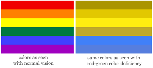
Visualizations that rely too much on color can pose a problem to users who are vision impaired or colorblind. Designing bar charts that look more like the one below can alleviate some of those problems, but the investigation into the best ways to present data for all users is ongoing.
[/cs_text][/cs_column][/cs_row][/cs_section][cs_section bg_color=”rgb(225, 229, 234)” parallax=”false” style=”margin: 0px 0px 0px 60px;padding: 10px 0px 45px;”][cs_row inner_container=”true” marginless_columns=”false” style=”margin: 0px auto;padding: 0px;”][cs_column fade=”false” fade_animation=”in” fade_animation_offset=”45px” fade_duration=”750″ type=”1/1″ style=”padding: 0px;”][x_feature_headline level=”h2″ looks_like=”h3″ icon=”cogs”]Assignment Description[/x_feature_headline][x_gap size=”30px”][cs_text]You will want to reserve two class periods for this assignment: one for discussing data and building a survey, followed by a homework assignment where students distribute the survey on their social media channels. You’ll need some time for your students and their peers to respond to the survey, so give it about a week before you come together and analyze the results.
If you don’t have a digital classroom, have your students go around the room and ask each other a couple of the survey questions, and then compile the information. If you have enough time, you can send the survey to each of your students through email (or post it on Canvas) and have them
These slides will give you a basic overview of the lesson plan, and can be used in class to present some of the key concepts. Feel free to modify this as you see fit.[/cs_text][/cs_column][/cs_row][cs_row inner_container=”true” marginless_columns=”false” style=”margin: 0px auto;padding: 0px;”][cs_column fade=”false” fade_animation=”in” fade_animation_offset=”45px” fade_duration=”750″ type=”1/2″ style=”padding: 0px;”][x_custom_headline level=”h2″ looks_like=”h5″ accent=”false”]Instructor Preparation[/x_custom_headline][cs_icon_list][cs_icon_list_item title=”Have a basic Google Form ready to fill out” type=”check” link_enabled=”false” link_url=”#” link_new_tab=”false”]Have a basic Google Form ready to fill out[/cs_icon_list_item][cs_icon_list_item title=”Familiarize yourself with Wordle” type=”check” link_enabled=”false” link_url=”#” link_new_tab=”false”]Familiarize yourself with Wordle[/cs_icon_list_item][cs_icon_list_item title=”Familiarize yourself with Raw and Datawrapper” type=”check” link_enabled=”false” link_url=”#” link_new_tab=”false”]Familiarize yourself with Raw and Datawrapper[/cs_icon_list_item][cs_icon_list_item title=”Review the attached slides for classroom presentation” type=”check” link_enabled=”false” link_url=”#” link_new_tab=”false”]Review the attached slides for classroom presentation[/cs_icon_list_item][/cs_icon_list][/cs_column][cs_column fade=”false” fade_animation=”in” fade_animation_offset=”45px” fade_duration=”750″ type=”1/2″ style=”padding: 0px;”][x_custom_headline level=”h2″ looks_like=”h5″ accent=”false”]Student Preparation[/x_custom_headline][cs_icon_list][cs_icon_list_item title=”To prepare for the second part of the lesson, students should blast the completed survey to their friends and social networks to maximize the number of responses before the second lesson (the next class).” type=”check” link_enabled=”false” link_url=”#” link_new_tab=”false”]To prepare for the second part of the lesson, students should blast the completed survey to their friends and social networks to maximize the number of responses before the second lesson (the next class).[/cs_icon_list_item][cs_icon_list_item title=”Student Preparation” type=”check” link_enabled=”false” link_url=”#” link_new_tab=”false”]Student Preparation[/cs_icon_list_item][cs_icon_list_item title=”Student Preparation” type=”check” link_enabled=”false” link_url=”#” link_new_tab=”false”]Student Preparation[/cs_icon_list_item][/cs_icon_list][/cs_column][/cs_row][cs_row inner_container=”true” marginless_columns=”false” style=”margin: 0px auto;padding: 0px;”][cs_column fade=”false” fade_animation=”in” fade_animation_offset=”45px” fade_duration=”750″ type=”1/1″ style=”padding: 0px;”][x_custom_headline level=”h2″ looks_like=”h5″ accent=”false”]In-Class or Assignment Instructions[/x_custom_headline][cs_icon_list][cs_icon_list_item title=”In the first class, you’ll come up with good survey questions as a group.” type=”chevron-right” link_enabled=”false” link_url=”#” link_new_tab=”false”]In the first class, you’ll come up with good survey questions as a group.[/cs_icon_list_item][cs_icon_list_item title=”In the second class, you’ll take the results of your survey, download the csv file, and plug them into a few different data visualization tools online” type=”chevron-right” link_enabled=”false” link_url=”#” link_new_tab=”false”]In the second class, you’ll take the results of your survey, download the csv file, and plug them into a few different data visualization tools online[/cs_icon_list_item][cs_icon_list_item title=”Student Instructions” type=”chevron-right” link_enabled=”false” link_url=”#” link_new_tab=”false”]Student Instructions[/cs_icon_list_item][/cs_icon_list][/cs_column][/cs_row][/cs_section][cs_section parallax=”false” style=”margin: 0px 0px 0px 60px;padding: 100px 0px;”][cs_row inner_container=”true” marginless_columns=”false” style=”margin: 0px auto;padding: 0px;”][cs_column id=”Google’s data center servers” fade=”false” fade_animation=”in” fade_animation_offset=”45px” fade_duration=”750″ type=”1/1″ class=”Google’s data center servers” style=”padding: 0px;”][x_image type=”none” src=”https://www.dwrl.utexas.edu/wp-content/uploads/2016/10/7-11-1.png” alt=”A photo of Google’s data center servers. ” link=”true” href=”#” title=”https://www.flickr.com/photos/robbiewendt/8108744459/in/photolist-dmxrdX-q9JM7Q-puiikQ-hc8ftV-5ruA5X-e8XXhJ-pCqgTx-5tJtkx-pCqer8-aoR6my-aaCT42-9cggqL-55W1-ut6sX-amX8zR-ut6sF-4pFVsF-ut6tg-ut6tA-emirP-hcdr4-6EYpWD-6EYuYF-6EYpWB-pCqbEg-hbVkhh-hdmfhc-qJdqw3-h9doHj-6LPjCg-bf2wyr-imfGnL-6Hj9Dc-2KCePD-jcK5w5-qJ6a78-aSW592-i3Rby3-i3NECz-qntpoT-pqEnLW-6EYpWH-bDE4Ep-66UVSF-hcdDh-pS2wH1-bCZzci-6EYsdF-4qcUxa-9uiSW6″ target=”blank” info=”none” info_place=”top” info_trigger=”hover” info_content=””][/cs_column][/cs_row][/cs_section][cs_section bg_color=”rgb(250, 250, 250)” parallax=”false” style=”margin: 0px 0px 0px 60px;padding: 10px 0px 45px;”][cs_row inner_container=”true” marginless_columns=”false” style=”margin: 0px auto;padding: 0px;”][cs_column fade=”false” fade_animation=”in” fade_animation_offset=”45px” fade_duration=”750″ type=”1/1″ style=”padding: 0px;”][x_feature_headline level=”h2″ looks_like=”h3″ icon=”pencil”]Skills Workshop[/x_feature_headline][x_gap size=”30px”][cs_text]How to Clean up a Data Set for RAW: OR, what RAW won’t tell you.
RAW is a fairly straightforward tool that makes amazing data visualizations in just a couple steps. The format is very plug-n-play, but there are a few things you should know before uploading your data to the site that can make things a little easier. You may find that you are somewhat limited with the data sets you’ll be able to visualize, because the pre-made visualizations to choose from are so varied and some are really specific. Cleaning up your data is also a big part of the process, because the site can only handle so much.
I started with a random set of anonymous 311 service requests made in 2015 to the City of New York. This data set came from NYC Open Data, a site with over 1500 data sets available for public use. However, the site will crash if you try to upload over one million rows of data. So what to do? This is where you need to make some decisions about what data you want to use, and what you can discard. In such a large data set, this inevitably brings up some rhetorical choices – what is most important to you to be remembered or highlighted in this data set, and what can be discarded?
Here is the data set for this workshop which you can download as a CSV to learn how RAW works. It’s a really big data set and may take a few minutes.
As you’ll see, a “raw” data set is pretty unruly:
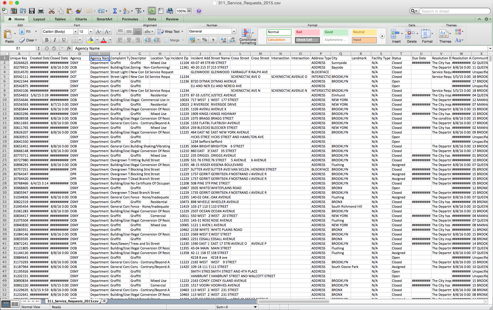
Yikes!
Pick what you think might be the most visually interesting and would like to learn something about. I started off by sorting the spreadsheet by “Complaint Type” to see what I’d want to isolate. You can do this with the “Sort” function in “Data” tab in Excel. First highlight all the data with a quick Ctrl+A, and sort by “Complaint type” or whatever fits your data set. Next copy+paste the title row into a new sheet, and then isolate the “rodent” data and paste that into the same sheet. Now you have a new sheet just about rodents. Now you’ll want to delete the columns that are unnecessary. In this case, you might want to delete all the columns except “rat sighting,” “location type,” and “borough.” (We know all the complaints are about rodents, so no need to keep the “complaint type” column anymore.
Now you can cut and paste your cleaned up data set into RAW. Once you paste your data set into the box on the homepage, about 12 different charts will pop up, and you’ll need to play around to find out which one tells the best story for your data.
To map your dimensions, you simply drag and drop the categories for your data. Using the Circular Dendogram chart, if you organize first by Borough, then by Descriptor, then by Location Type, you’ll get something like this:

What is the story this data set tells you now? Try organizing the hierarchy in a few different ways and in a few different charts.
If you try plugging this particular data set into a few of the other chart options, either it won’t work or you’ll get a big mess, especially with charts that require numbers to be plotted on X and Y axes. Raw also isn’t the best choice for data that would be best interpreted on a map, because the site can’t do that. It would be really cool to plot all this NYC rat data over a map of NYC, which is something Datawrapper can do. How would that story be different from the one above?
[/cs_text][/cs_column][/cs_row][/cs_section][cs_section bg_color=”rgb(225, 229, 234)” parallax=”false” style=”margin: 0px 0px 0px 60px;padding: 10px 0px;”][cs_row inner_container=”true” marginless_columns=”false” style=”margin: 0px auto;padding: 0px;”][cs_column fade=”false” fade_animation=”in” fade_animation_offset=”45px” fade_duration=”750″ type=”1/1″ style=”padding: 0px;”][x_feature_headline level=”h2″ looks_like=”h3″ icon=”paperclip”]Assessment Suggestions[/x_feature_headline][x_gap size=”30px”][cs_text]This lesson plan is primarily about introductions, experimenting, and learning to work in a group. However, if you wanted to assign something like this as a final project, you could have each student do their own survey, or a put students in groups and have them work through the steps of writing a survey and visualizing the results. [/cs_text][x_gap size=”20px”][x_tab_nav type=”two-up” float=”top”][x_tab_nav_item title=”Suggestions for Portfolio-Style Assessment” active=”true”][x_tab_nav_item title=”Suggestions for Traditional Assessment” active=”false”][/x_tab_nav][x_tabs][x_tab active=”true”]Have your students write a one-page reflection on the assignment and how it went. How did they go about writing and revising their survey questions? How did they distribute them? Ask your students to reflect on the process of collecting their data, and whether or not they consider the project a success, and why. [/x_tab][x_tab active=”false”]Gain access to your students’ surveys and assess how the questions were written. Were they unbiased and clear? Were there any leading questions or questions that needed to be split into two? Could they have tweaked the rhetoric of the survey somewhat to get better results? If they didn’t have enough responses, how could they have promoted their survey to their audience more effectively? [/x_tab][/x_tabs][/cs_column][/cs_row][/cs_section][/cs_content]