[cs_content][cs_section parallax=”false” style=”margin: 0px;padding: 45px 0px;”][cs_row inner_container=”true” marginless_columns=”false” style=”margin: 0px auto;padding: 0px;”][cs_column fade=”false” fade_animation=”in” fade_animation_offset=”45px” fade_duration=”750″ type=”1/1″ style=”padding: 0px;”][cs_text]Team Data Visualization is proud to present a set of lesson plans that are ready to use in your classroom (networked or not). Whether you’ve been thinking about introducing a data visualization lesson of some kind, or have no idea what that would even look like or how it would fit in a writing classroom (or any classroom for that matter), we’ve got you covered.
We’ve designed this set of lesson plans to be cohesive, but you can pick any lesson to use that best suits your classroom needs. The most important thing to remember is that anyone can do a data visualization lesson plan – the technical skills required are minimal. If you can use a computer, you can teach data visualization. We’ve picked tools that are pretty much plug-n-play – there’s so much available online that makes visualizing data (big and small) incredibly easy.[/cs_text][x_slider animation=”slide” slide_time=”7000″ slide_speed=”1000″ slideshow=”false” random=”false” control_nav=”false” prev_next_nav=”true” no_container=”false” ][x_slide]
Sarah Welsh uses a few online tools like Google Forms and RAW to get students started with data collection and experimental visualization in a two-day lesson plan and accompanying homework assignment. Students engage with some of the rhetorical implications of surveys for data collection and the varied arguments that visualizing data in different ways can produce.[/x_slide][x_slide]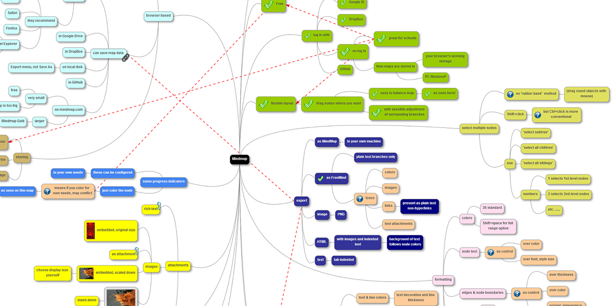
Sierra Mendez uses her expertise in MindMup – a digital mindmapping tool – to help students recognize patterns in their own research in order to generate their thesis statements.[/x_slide][x_slide]
Mac Scott uses Piktochart to help students develop rhetorical literacy regarding data visualization. By remediating a small amount of alpha-numeric data from a government report on food waste into a multimodal composition, students collaboratively confront, work through, and discuss the rhetorical affordances and limitations of both composition modes.[/x_slide][/x_slider][cs_text]We hope your classroom practice will benefit. Enjoy!
Teaching in a DWRL classroom? Need a hand or want to schedule a data visualization workshop for your students? Visit our mentoring office in PAR 8B or email a staff member to learn more about our consulting and support services.
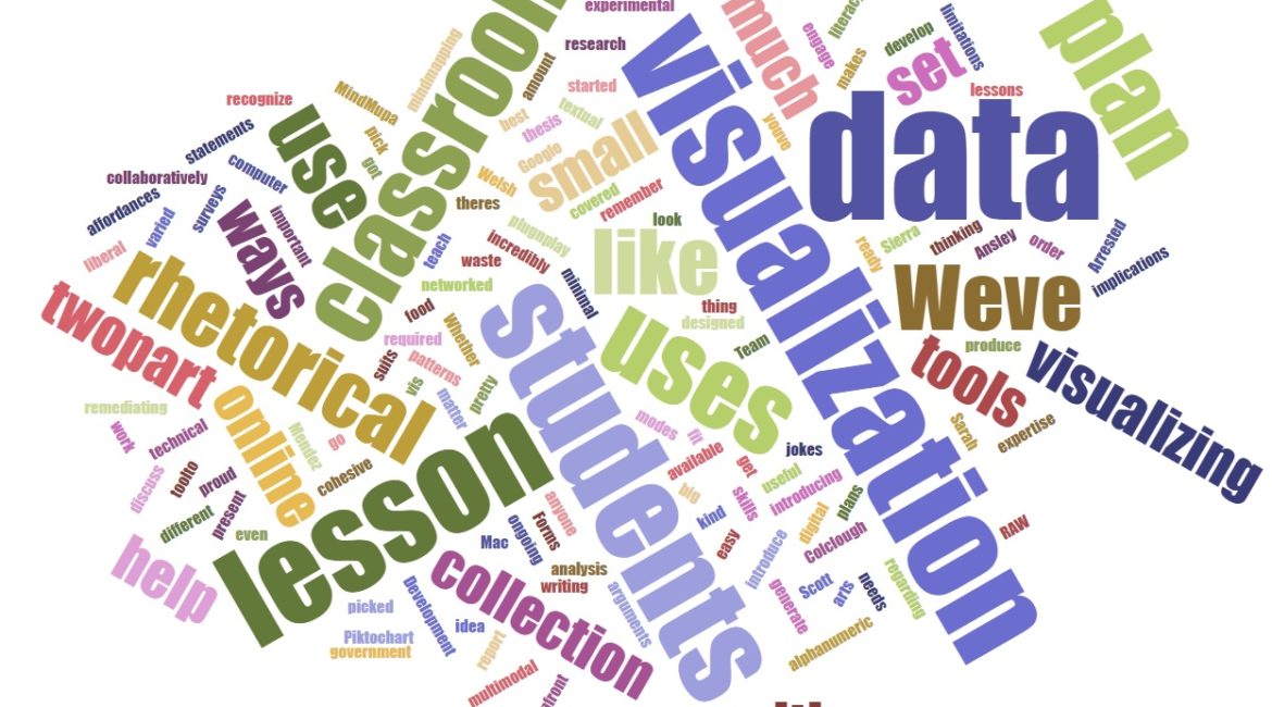
Featured image: A word cloud made with the 200 most common words in this post.[/cs_text][/cs_column][/cs_row][/cs_section][cs_section parallax=”false” style=”margin: 0px;padding: 45px 0px;”][cs_row inner_container=”true” marginless_columns=”false” style=”margin: 0px auto;padding: 0px;”][cs_column fade=”false” fade_animation=”in” fade_animation_offset=”45px” fade_duration=”750″ type=”1/3″ style=”padding: 0px;”][x_button size=”global” block=”false” circle=”false” icon_only=”false” href=”https://www.dwrl.utexas.edu/2016/10/31/database-rhetorics/” title=”” target=”” info=”none” info_place=”top” info_trigger=”hover” info_content=””]Database Rhetorics[/x_button][/cs_column][cs_column fade=”false” fade_animation=”in” fade_animation_offset=”45px” fade_duration=”750″ type=”1/3″ style=”padding: 0px;”][x_button size=”global” block=”false” circle=”false” icon_only=”false” href=”https://www.dwrl.utexas.edu/2016/10/31/lesson-plan-navigating-research-with-mindmup/” title=”” target=”” info=”none” info_place=”top” info_trigger=”hover” info_content=””]Navigating Research[/x_button][/cs_column][cs_column fade=”false” fade_animation=”in” fade_animation_offset=”45px” fade_duration=”750″ type=”1/3″ style=”padding: 0px;”][x_button size=”global” block=”false” circle=”false” icon_only=”false” href=”https://www.dwrl.utexas.edu/2016/10/31/infographic-recomposition/” title=”” target=”” info=”none” info_place=”top” info_trigger=”hover” info_content=””]Visual Literacy[/x_button][/cs_column][/cs_row][/cs_section][/cs_content]