[cs_content][cs_section parallax=”false” separator_top_type=”none” separator_top_height=”50px” separator_top_angle_point=”50″ separator_bottom_type=”none” separator_bottom_height=”50px” separator_bottom_angle_point=”50″ style=”margin: 0px;padding: 50px 0px 10px;”][cs_row inner_container=”true” marginless_columns=”false” style=”margin: 0px auto;padding: 0px;”][cs_column fade=”false” fade_animation=”in” fade_animation_offset=”45px” fade_duration=”750″ type=”1/1″ style=”padding: 0px;”][x_image type=”none” src=”https://www.dwrl.utexas.edu/wp-content/uploads/2016/10/apple-on-desk.jpg” alt=”””” link=”false” href=”#” title=”” target=”” info=”none” info_place=”top” info_trigger=”hover” info_content=””][/cs_column][/cs_row][/cs_section][cs_section bg_color=”hsl(0, 0%, 100%)” parallax=”false” separator_top_type=”none” separator_top_height=”50px” separator_top_angle_point=”50″ separator_bottom_type=”none” separator_bottom_height=”50px” separator_bottom_angle_point=”50″ class=”cs-ta-left” style=”margin: 0px;padding: 45px 0px;”][cs_row inner_container=”true” marginless_columns=”false” style=”margin: 0px auto;padding: 0px;”][cs_column fade=”false” fade_animation=”in” fade_animation_offset=”45px” fade_duration=”750″ type=”2/3″ style=”padding: 0px;”][cs_text]In Multiliteracies for a Digital Age, Stuart Selber discusses the importance of pedagogy that cultivates, what he refers to as, multiliteracies, where students strive to be “users of technology . . . questioners of technology . . . producers of technology” (25). This idea of multiliteracies pushes beyond a focus on teaching students the technical functions of technology (though that still has a place) to emphasize that students also need to hone their rhetorical and critical capacities.
Working with visual rhetoric but in the same vein, Marisa Sandoval Lamb, Jenna Sheffield, and Kristin Winet have more recently discussed the importance of finding the “right balance between compositional freedom and technological literacy.” In “Three Ways In: Teaching Visual Rhetoric through Web-based Infographic Programs,” the authors share pedagogical activities and assignments (also with Piktochart) that navigate the complexities of technological instruction, digital writing, and rhetorical analysis.
In an attempt to explore such tensions, this lesson plan is positioned as an in-class activity where students create infographics around data visualization.[/cs_text][x_custom_headline level=”h3″ looks_like=”h5″ accent=”false”]Learning Objectives[/x_custom_headline][cs_text]This lesson works to develop rhetorical literacy regarding data visualization by working with the infographic program Piktochart. By remediating a small amount of alpha-numeric data from a government report on food waste into a multimodal composition, students collaboratively confront, work through, and discuss the rhetorical affordances and limitations of both composition modes.
As this lesson spans two class periods, students aren’t intended to become infographic (or even Piktochart) experts. Rather it’s meant to spark a discussion concerning visual rhetoric and data visualization. The emphasis isn’t on a “finished” infographic, but on the generative potential, frustrations, assumptions, and writing strategies (helpful or not) that manifest through the activity. Additionally, students will gain exposure to a drag-and-drop program that they can use in and outside the classroom.
By the end of the lesson, students will:[/cs_text][cs_icon_list][cs_icon_list_item title=”Analyze data conveyed alpha-numerically, and discover ways of re-imagining that inforamtion” type=”check” link_enabled=”false” link_url=”#” link_new_tab=”false”]Analyze data conveyed alpha-numerically, and discover ways of re-imagining that inforamtion[/cs_icon_list_item][cs_icon_list_item title=”Re-compose that data in a medium that utilizes words and images, and discuss the challenges therein (technical and otherwise)” type=”check” link_enabled=”false” link_url=”#” link_new_tab=”false”]Re-compose that data in a medium that utilizes words and images, and discuss the challenges therein (technical and otherwise)[/cs_icon_list_item][cs_icon_list_item title=”Articulate the affordances and limitations of alpha-numeric and multimodal compositions as well as different media (pen and paper, computer)” type=”check” link_enabled=”false” link_url=”#” link_new_tab=”false”]Articulate the affordances and limitations of alpha-numeric and multimodal compositions as well as different media (pen and paper, computer)[/cs_icon_list_item][/cs_icon_list][/cs_column][cs_column fade=”false” fade_animation=”in” fade_animation_offset=”45px” fade_duration=”750″ type=”1/3″ style=”padding: 0px 0px 0px 30px;”][x_feature_list][x_feature_box title=”Assignment Length” title_color=”” text_color=”” graphic=”icon” graphic_size=”40px” graphic_shape=”circle” graphic_color=”#ffffff” graphic_bg_color=”rgb(140, 140, 140)” align_h=”left” align_v=”top” side_graphic_spacing=”10px” max_width=”200px” child=”true” connector_width=”1 px” connector_style=”dashed” connector_color=”#272727″ graphic_icon=”clock-o”]Two classes[/x_feature_box][x_feature_box title=”Required Materials” title_color=”” text_color=”” graphic=”icon” graphic_size=”40px” graphic_shape=”circle” graphic_color=”#ffffff” graphic_bg_color=”hsl(0, 0%, 56%)” align_h=”left” align_v=”top” side_graphic_spacing=”10px” max_width=”200px” child=”true” connector_width=”1 px” connector_style=”dashed” connector_color=”#272727″ graphic_icon=”cut”]Photo scanner (a smartphone camera that can email photos will also work); computers with Internet access; projector connected to instructor’s computer[/x_feature_box][x_feature_box title=”Skills Necessary” title_color=”” text_color=”” graphic=”icon” graphic_size=”40px” graphic_shape=”circle” graphic_color=”#ffffff” graphic_bg_color=”rgb(140, 140, 140)” align_h=”left” align_v=”top” side_graphic_spacing=”10px” max_width=”200px” child=”true” connector_width=”1 px” connector_style=”dashed” connector_color=”#272727″ graphic_icon=”download”]If using a classroom scanner, it’ll be necessary to know how to work that equipment and upload an image to Piktochart[/x_feature_box][/x_feature_list][/cs_column][/cs_row][/cs_section][cs_section bg_color=”rgb(250, 250, 250)” parallax=”false” separator_top_type=”none” separator_top_height=”50px” separator_top_angle_point=”50″ separator_bottom_type=”none” separator_bottom_height=”50px” separator_bottom_angle_point=”50″ style=”margin: 0px 0px 0px 60px;padding: 10px 0px 45px;”][cs_row inner_container=”true” marginless_columns=”false” style=”margin: 0px auto;padding: 0px;”][cs_column fade=”false” fade_animation=”in” fade_animation_offset=”45px” fade_duration=”750″ type=”1/1″ style=”padding: 0px;”][x_feature_headline level=”h2″ looks_like=”h3″ icon=”globe”]Access and Adaptability[/x_feature_headline][x_gap size=”30px”][cs_text]While the lesson utilizes classroom computers, Internet access, a scanner, and a projector, the focus isn’t on technical mastery of Piktochart but on experiencing, working through, and struggling with a more visual medium. Therefore, if certain technologies aren’t available, it might be possible for students to sketch a draft of an entire infographic by hand. Rather than working with Piktochart, students would spend class time composing posters, which certainly lends itself to similar discussions concerning visual rhetoric.
[/cs_text][/cs_column][/cs_row][/cs_section][cs_section bg_color=”rgb(225, 229, 234)” parallax=”false” separator_top_type=”none” separator_top_height=”50px” separator_top_angle_point=”50″ separator_bottom_type=”none” separator_bottom_height=”50px” separator_bottom_angle_point=”50″ style=”margin: 0px 0px 0px 60px;padding: 10px 0px 45px;”][cs_row inner_container=”true” marginless_columns=”false” style=”margin: 0px auto;padding: 0px;”][cs_column fade=”false” fade_animation=”in” fade_animation_offset=”45px” fade_duration=”750″ type=”1/1″ style=”padding: 0px;”][x_feature_headline level=”h2″ looks_like=”h3″ icon=”cogs”]Assignment Description[/x_feature_headline][x_gap size=”30px”][cs_text]It would be beneficial to have students watch/read Piktochart tutorials prior to class. The DWRL has synthesized a lot of this information already.
At the start of class, pull up the (very short) report summary on food waste in 2010 from the United States Department of Agriculture and let the students read through it. Then, ask the students to focus on the following: “In the United States, 31 percent—or 133 billion pounds—of the 430 billion pounds of the available food supply at the retail and consumer levels in 2010 went uneaten. . . . The estimated total value of food loss at the retail and consumer levels in the United States was $161.6 billion in 2010.”
Discuss the rhetorical effectiveness (or potential lack thereof) of this data in terms of how it’s presented on the website. How can you even conceptualize numbers (pounds and dollars) of that magnitude? What are the advantages of alpha-numerics here? What are the drawbacks?
Then, inform students that the focus of the activity is to recompose this data by making it more visual. Have them break into groups of three. Once in groups, students will use Piktochart to visually convey the data from the reports. As this is a two day in-class activity and not positioned as a unit on infographics, the lesson includes certain guidelines, which can be considered constraints but also composition elements with generative potential–something for students to work within and against.
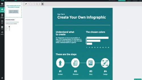
In particular, students are required to use one chart provided by Piktochart. In addition to that chart, they must also use Piktochart’s archive of icons and images and/or photos from the Internet in their infographic. Whereas the Piktochart-provided chart is somewhat limited in terms of flexibility. In terms of the latter, students have free-rein. However, the aim isn’t to create another chart, but to help their audience (the rest of the class) conceptualize the USDA report data. How much is 133 billion pounds? How much is $161.6 dollars? Can they come up with a way to help the rest of the class visualize that information?
One potential route would be for students to create visual metaphors. For example, if you’re 24 years old, you could say that you are 2 x Millie Bobby Brown from Stranger Things…

…but half as cool. You’d probably want to incorporate a photo of the actress (or the character she plays on the show). Students should strive to find inventive ways of communicating that data, but through a concise interplay of words and images.
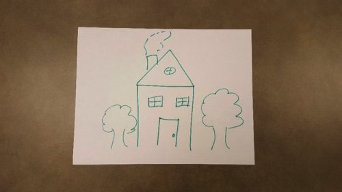
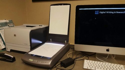
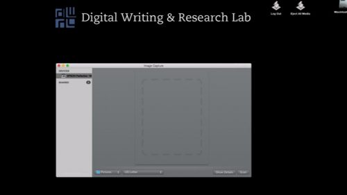
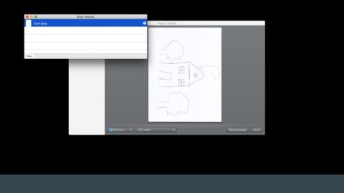
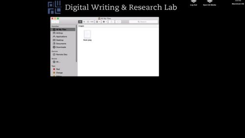
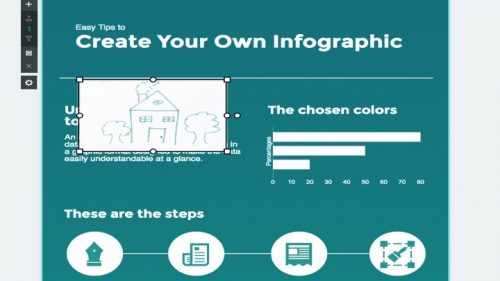
Here, student’s ideas for images may outpace their technical capabilities with Piktochart. But encourage this. Students should sketch complicated design ideas by hand. If they don’t already have the know-how or time to create these images in Piktochart, you can scan and upload their sketches into that program. (Alternatively, if students are able and willing, they can take pictures with their phones; however, quality may be off). Sketches can be inserted into the infographic to gesture toward what manipulated images would ideally look like, acting as placeholders of sorts.
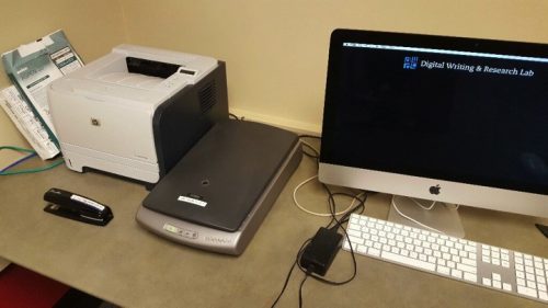
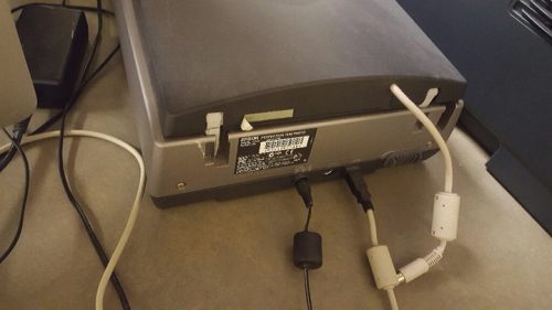
After drafting, have students download and email their infographics to you. Students then answer the questions on the exercise handout. Afterwards, pull up the infographics through the class projector and have the students discuss the choices they made, using their responses to the handout as a guideline.[/cs_text][/cs_column][/cs_row][cs_row inner_container=”true” marginless_columns=”false” style=”margin: 0px auto;padding: 0px;”][cs_column fade=”false” fade_animation=”in” fade_animation_offset=”45px” fade_duration=”750″ type=”1/2″ style=”padding: 0px;”][x_custom_headline level=”h2″ looks_like=”h5″ accent=”false”]Instructor Preparation[/x_custom_headline][cs_icon_list][cs_icon_list_item title=”Review Piktochart tutorials and have basic knowledge of program (tutorials could be covered at beginning of class, if necessary” type=”check” link_enabled=”false” link_url=”#” link_new_tab=”false”]Review Piktochart tutorials and have basic knowledge of program (tutorials could be covered at beginning of class, if necessary[/cs_icon_list_item][cs_icon_list_item title=”Print exercise handouts” type=”check” link_enabled=”false” link_url=”#” link_new_tab=”false”]Print exercise handouts[/cs_icon_list_item][cs_icon_list_item title=”Check out a photo scanner from DWRL if the room isn’t already equipped” type=”check” link_enabled=”false” link_url=”#” link_new_tab=”false”]Check out a photo scanner from DWRL if the room isn’t already equipped[/cs_icon_list_item][/cs_icon_list][/cs_column][cs_column fade=”false” fade_animation=”in” fade_animation_offset=”45px” fade_duration=”750″ type=”1/2″ style=”padding: 0px;”][x_custom_headline level=”h2″ looks_like=”h5″ accent=”false”]Student Preparation[/x_custom_headline][cs_icon_list][cs_icon_list_item title=”Create a free Piktochart account” type=”check” link_enabled=”false” link_url=”#” link_new_tab=”false”]Create a free Piktochart account[/cs_icon_list_item][/cs_icon_list][cs_icon_list][cs_icon_list_item title=”Prior to class, watch and read Piktochart tutorials provided by instructor” type=”check” link_enabled=”false” link_url=”#” link_new_tab=”false”]Prior to class, watch and read Piktochart tutorials provided by instructor[/cs_icon_list_item][/cs_icon_list][/cs_column][/cs_row][cs_row inner_container=”true” marginless_columns=”false” style=”margin: 0px auto;padding: 0px;”][cs_column fade=”false” fade_animation=”in” fade_animation_offset=”45px” fade_duration=”750″ type=”1/1″ style=”padding: 0px;”][x_custom_headline level=”h2″ looks_like=”h5″ accent=”false”]In-Class Activity Instructions[/x_custom_headline][cs_icon_list][cs_icon_list_item title=”Each group member signs into Piktochart and opens the free infographic template “Minimalist 2.” Groups can change the template as they see fit, but they must begin from the same starting point. (As the assignment progresses, groups should focus their work on one member’s account, but everyone needs to have the program pulled up so they can explore its capabilities.)” type=”chevron-right” link_enabled=”false” link_url=”#” link_new_tab=”false”]Each group member signs into Piktochart and opens the free infographic template “Minimalist 2.” Groups can change the template as they see fit, but they must begin from the same starting point. (As the assignment progresses, groups should focus their work on one member’s account, but everyone needs to have the program pulled up so they can explore its capabilities.)[/cs_icon_list_item][cs_icon_list_item title=”Create an infographic with the information from the USDA summary report.” type=”chevron-right” link_enabled=”false” link_url=”#” link_new_tab=”false”]Create an infographic with the information from the USDA summary report.[/cs_icon_list_item][cs_icon_list_item title=”Groups are required to incorporate one Piktochart chart into their text; they can select and edit anyone they choose. This requires groups to discuss which graph best suits their aims.” type=”chevron-right” link_enabled=”false” link_url=”#” link_new_tab=”false”]Groups are required to incorporate one Piktochart chart into their text; they can select and edit anyone they choose. This requires groups to discuss which graph best suits their aims.[/cs_icon_list_item][/cs_icon_list][cs_icon_list][cs_icon_list_item title=”Groups need to use Piktochart’s icon/photo archive and/or upload images from the Internet and discover a means of expressing that data in a visually inventive way.” type=”chevron-right” link_enabled=”false” link_url=”#” link_new_tab=”false”]Groups need to use Piktochart’s icon/photo archive and/or upload images from the Internet and discover a means of expressing that data in a visually inventive way.[/cs_icon_list_item][cs_icon_list_item title=”For designs too complicated for the time allotted, students sketch their ideas with pen and paper, which they can then upload to Piktochart and insert as a placeholder in their draft.” type=”chevron-right” link_enabled=”false” link_url=”#” link_new_tab=”false”]For designs too complicated for the time allotted, students sketch their ideas with pen and paper, which they can then upload to Piktochart and insert as a placeholder in their draft.[/cs_icon_list_item][cs_icon_list_item title=”Students eventually send their infographics to the instructor, answer the questions on the handout, and present their work. During and after the presentation, the class discusses the benefits, constraints, and frustrations of this mode of composition. Groups also share strategies used to design their texts.” type=”chevron-right” link_enabled=”false” link_url=”#” link_new_tab=”false”]Students eventually send their infographics to the instructor, answer the questions on the handout, and present their work. During and after the presentation, the class discusses the benefits, constraints, and frustrations of this mode of composition. Groups also share strategies used to design their texts.[/cs_icon_list_item][/cs_icon_list][/cs_column][/cs_row][/cs_section][cs_section parallax=”false” separator_top_type=”none” separator_top_height=”50px” separator_top_angle_point=”50″ separator_bottom_type=”none” separator_bottom_height=”50px” separator_bottom_angle_point=”50″ style=”margin: 0px 0px 0px 60px;padding: 100px 0px;”][cs_row inner_container=”true” marginless_columns=”false” style=”margin: 0px auto;padding: 0px;”][cs_column fade=”false” fade_animation=”in” fade_animation_offset=”45px” fade_duration=”750″ type=”1/1″ style=”padding: 0px;”][x_image type=”none” src=”https://www.dwrl.utexas.edu/wp-content/uploads/2016/10/Pencil-and-laptop.jpg” alt=”””” link=”false” href=”#” title=”” target=”” info=”none” info_place=”top” info_trigger=”hover” info_content=””][/cs_column][/cs_row][/cs_section][cs_section bg_color=”rgb(250, 250, 250)” parallax=”false” separator_top_type=”none” separator_top_height=”50px” separator_top_angle_point=”50″ separator_bottom_type=”none” separator_bottom_height=”50px” separator_bottom_angle_point=”50″ style=”margin: 0px 0px 0px 60px;padding: 10px 0px 45px;”][cs_row inner_container=”true” marginless_columns=”false” style=”margin: 0px auto;padding: 0px;”][cs_column fade=”false” fade_animation=”in” fade_animation_offset=”45px” fade_duration=”750″ type=”1/1″ style=”padding: 0px;”][x_feature_headline level=”h2″ looks_like=”h3″ icon=”pencil”]Skills Workshop[/x_feature_headline][x_gap size=”30px”][cs_text]As mentioned previously, students may wish to incorporate a hand-drawn sketch into their infographic. Students may be able to do this through a cellphone photo, but a scanned image can provide better quality. Below are step-by-step instructions for those teachers interested in using a DWRL scanner for this lesson.[/cs_text][x_slider animation=”slide” slide_time=”7000″ slide_speed=”1000″ slideshow=”false” random=”false” control_nav=”true” prev_next_nav=”true” no_container=”false” ][x_slide] [/x_slide][x_slide]
[/x_slide][x_slide]
[/x_slide][x_slide]
[/x_slide][x_slide]
[/x_slide][x_slide]

[/x_slide][x_slide]
[/x_slide][x_slide]
[/x_slide][x_slide]
[/x_slide][x_slide]
[/x_slide][x_slide]
[/x_slide][/x_slider][/cs_column][/cs_row][/cs_section][cs_section bg_color=”rgb(225, 229, 234)” parallax=”false” separator_top_type=”none” separator_top_height=”50px” separator_top_angle_point=”50″ separator_bottom_type=”none” separator_bottom_height=”50px” separator_bottom_angle_point=”50″ style=”margin: 0px 0px 0px 60px;padding: 10px 0px;”][cs_row inner_container=”true” marginless_columns=”false” style=”margin: 0px auto;padding: 0px;”][cs_column fade=”false” fade_animation=”in” fade_animation_offset=”45px” fade_duration=”750″ type=”1/1″ style=”padding: 0px;”][x_feature_headline level=”h2″ looks_like=”h3″ icon=”paperclip”]Assessment Suggestions[/x_feature_headline][cs_text]Assessment will depend on how instructors see this lesson fitting into their overall class. As I’ve positioned it, the primary methods of assessment herein are the student responses to the worksheet and the ensuing class discussion, which aren’t graded. Students will self-assess as well as receive oral feedback from the class and the instructor. Instructors should encourage students to discuss how preconceptions of visual and alphanumeric compositions influenced the activity. In this sense, the activity (including the worksheet and the discussion) can be framed as an attempt to get students to articulate previously tacit knowledge about infographics by analyzing their own compositions and the uncertanties therein.[/cs_text][x_tab_nav type=”two-up” float=”top”][x_tab_nav_item title=”Suggestions for Portfolio-Style Assessment” active=”true”][x_tab_nav_item title=”Suggestions for Traditional Assessment” active=”false”][/x_tab_nav][x_tabs][x_tab active=”true”]Instructors may choose to treat this lesson as the first in a unit, where groups are required to make revisions based, in part, on their responses to the worksheet and the feedback of the class. In this case, instructors may consider taking a more genre studies approach to the unit, where, after drafting, students are asked to research infographics by collecting sample texts in order to identify genre conventions. Students can then revise their drafts such that they align with (or diverge from) the conventions they’ve described. Along with their revision, students supply a write-up establishing their own criteria as to what makes rhetorically effective infographics, as well as detail instances where and why their own infographic meets or breaks from such criteria. In this sense, the revised infographic isn’t privileged in terms of design quality, but as an artifact of reference where students articulate strategies they used to make revisions, their justifications for specific design elements, as well as why they believe their revised infographic is more rhetorically effective than their draft.[/x_tab][x_tab active=”false”]If instructors are interested in grading the revised infographics, it would be beneficial to spend class time prior to this lesson researching the genre of infographics and working with students to develop a list of criteria as to what effective infographics look like within the context of this class. For this, students could be required to bring in approximately 5 examples of infographics as well as a few secondary sources with “experts” discussing infographic “best practices.” From the diverse findings of the students, and the guidance of the instructor, the class can collaboratively establish a grading rubric for their infographics.[/x_tab][/x_tabs][x_gap size=”30px”][x_gap size=”20px”][/cs_column][/cs_row][/cs_section][/cs_content]