
[cs_content][cs_section parallax="false" separator_top_type="none" separator_top_height="50px" separator_top_angle_point="50" separator_bottom_type="none" separator_bottom_height="50px" separator_bottom_angle_point="50" _order="0" style="margin: 0px;padding: 50px 0px 10px;"][cs_row inner_container="true" marginless_columns="false" style="margin: 0px auto;padding: 0px;"][cs_column fade="false" fade_animation="in" fade_animation_offset="45px" fade_duration="750" type="1/1" style="padding: 0px;"][x_image type="none" src="http://www.dwrl.utexas.edu/wp-content/uploads/2017/11/giphy.gif" alt="" link="false" href="#" title="" target="" info="none" info_place="top" info_trigger="hover" info_content=""][/cs_column][/cs_row][/cs_section][cs_section bg_color="hsl(0, 0%, 100%)" parallax="false" separator_top_type="none" separator_top_height="50px" separator_top_angle_point="50" separator_bottom_type="none" separator_bottom_height="50px" separator_bottom_angle_point="50" class="cs-ta-left" style="margin:...
Lesson Plan: Perspective API – Rhetorical Metadata, Pathos, and the Future of Internet Moderators
[cs_content][cs_section parallax="false" separator_top_type="none" separator_top_height="50px" separator_top_angle_point="50" separator_bottom_type="none" separator_bottom_height="50px" separator_bottom_angle_point="50" style="margin: 0px;padding: 50px 0px 10px;"][cs_row inner_container="true" marginless_columns="false" style="margin: 0px auto;padding: 0px;"][cs_column fade="false" fade_animation="in" fade_animation_offset="45px" fade_duration="750" type="1/1" style="padding: 0px;"][x_image type="none" src="http://www.dwrl.utexas.edu/wp-content/uploads/2017/03/Screen-Shot-2017-03-02-at-4.13.39-PM.png" alt="" link="false" href="#" title="" target="" info="none" info_place="top" info_trigger="hover" info_content=""][/cs_column][/cs_row][/cs_section][cs_section bg_color="hsl(0, 0%, 100%)" parallax="false" separator_top_type="none" separator_top_height="50px" separator_top_angle_point="50" separator_bottom_type="none" separator_bottom_height="50px" separator_bottom_angle_point="50" class="cs-ta-left" style="margin: 0px;padding:...
Lesson Plan: Infographics – Digital, Visual Stories
[cs_content][cs_section parallax="false" separator_top_type="none" separator_top_height="50px" separator_top_angle_point="50" separator_bottom_type="none" separator_bottom_height="50px" separator_bottom_angle_point="50" style="margin: 0px;padding: 45px 0px;"][cs_row inner_container="true" marginless_columns="false" style="margin: 0px auto;padding: 0px;"][cs_column fade="false" fade_animation="in" fade_animation_offset="45px" fade_duration="750" type="1/1" style="padding: 0px;"][cs_text] [/cs_text][/cs_column][/cs_row][/cs_section][cs_section bg_color="hsl(0, 0%, 100%)" parallax="false" separator_top_type="none" separator_top_height="50px" separator_top_angle_point="50" separator_bottom_type="none" separator_bottom_height="50px" separator_bottom_angle_point="50" class="cs-ta-left" style="margin: 0px;padding: 0px 0px 45px;"][cs_row inner_container="true" marginless_columns="false" style="margin: 0px auto;padding: 0px;"][cs_column fade="false" fade_animation="in"...
Lesson Plan: Transforming Data Visualizations
[cs_content][cs_section bg_color="hsl(0, 0%, 100%)" parallax="false" class="cs-ta-left" style="margin: 0px;padding: 45px 0px;"][cs_row inner_container="true" marginless_columns="false" style="margin: 0px auto;padding: 0px;"][cs_column fade="false" fade_animation="in" fade_animation_offset="45px" fade_duration="750" type="2/3" style="padding: 0px;"][cs_text]Contemporary rhetorical theory privileges a view of rhetoric as dynamic, where texts circulate both spatially and temporally to myriad effects. For instance, in her influential article "Unframing Models...
Lesson Plan: Visualizing and Analyzing Terministic Screens with Voyant
[cs_content][cs_section parallax="false" separator_top_type="none" separator_top_height="50px" separator_top_angle_point="50" separator_bottom_type="none" separator_bottom_height="50px" separator_bottom_angle_point="50" style="margin: 0px;padding: 50px 0px 10px;"][cs_row inner_container="true" marginless_columns="false" style="margin: 0px auto;padding: 0px;"][cs_column fade="false" fade_animation="in" fade_animation_offset="45px" fade_duration="750" type="1/1" style="padding: 0px 0px 0px 50px;"][x_image type="none" src="http://www.dwrl.utexas.edu/wp-content/uploads/2017/02/Terministic-Screens.png" alt="Word cloud created with Voyant's Cirrus feature displaying essential terms from Kenneth Burke's Terministic Screens." link="false" href="#" title="" target=""...
We Need to Talk About Credibility

Last week I hid someone from my Facebook news feed. We’ve all done it, and I’m sure people have done it to me. I was tired of seeing things that I found obnoxious or insipid or offensive or false or all of the above, and rather than unfriend them, I...
Lesson Plan: Peer Recordings, or Revising Peer Review
[cs_content][cs_section parallax="false" separator_top_type="none" separator_top_height="50px" separator_top_angle_point="50" separator_bottom_type="none" separator_bottom_height="50px" separator_bottom_angle_point="50" style="margin: 0px;padding: 50px 0px 10px;"][cs_row inner_container="true" marginless_columns="false" style="margin: 0px auto;padding: 0px;"][cs_column fade="false" fade_animation="in" fade_animation_offset="45px" fade_duration="750" type="1/1" style="padding: 0px;"][x_image type="none" src="http://www.dwrl.utexas.edu/wp-content/uploads/2016/11/keyboard-621832_960_720.jpg" alt="Close-up shot of a black keyboard on which rests a pen and a crumpled up piece of paper." link="false" href="#" title="" target=""...
Lesson Plan: Photography, Photoshop, and Visual Rhetoric
[cs_content][cs_section parallax="false" separator_top_type="none" separator_top_height="50px" separator_top_angle_point="50" separator_bottom_type="none" separator_bottom_height="50px" separator_bottom_angle_point="50" style="margin: 0px;padding: 45px 0px;"][cs_row inner_container="true" marginless_columns="false" style="margin: 0px auto;padding: 0px;"][cs_column fade="false" fade_animation="in" fade_animation_offset="45px" fade_duration="750" type="1/1" style="padding: 0px;"][cs_text class="cs-ta-center"]By Sierra Mendez & Sarah Welsh[/cs_text][/cs_column][/cs_row][/cs_section][cs_section parallax="false" separator_top_type="none" separator_top_height="50px" separator_top_angle_point="50" separator_bottom_type="none" separator_bottom_height="50px" separator_bottom_angle_point="50" style="margin: 0px;padding: 50px 0px 10px;"][cs_row inner_container="true" marginless_columns="false" style="margin: 0px auto;padding: 0px;"][cs_column fade="false"...
(Re)visualizing Data

Team Data Visualization is proud to present a new set of lesson plans that we've designed to be as cohesive as the first. With a little planning, anyone can share a data visualization lesson plan with their students. Sarah Welsh and Sierra Mendez collaborated on two lesson plans. The first takes inspiration from...
Cool Tools: Tableau
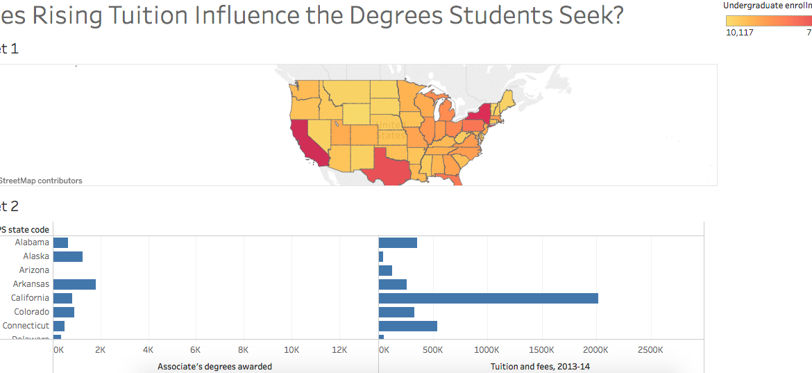
Last Friday, the DWRL hosted another workshop in preparation for the digitally accessible map we plan to create for our diverse student body. In conjunction with a discussion of collecting and analyzing data, Amy Tuttle provided an excellent lesson on Tableau, an online service that allows users to re-present data...